ABC 7 Denver 1552 Posted January 10 Share Posted January 10 3 hours ago, Weeters said: I really like the overall lower thirds/OTS/boxes/etc (though there are some questionable choices in certain aspects). You can really tell a lot of thought went into making this into a comprehensive package where everything works with everything else. The in-show graphics remind me a lot of the original NewsNation graphics and the ABC O&O package being rolled out. But... and I know this is a tough pill for some to swallow, but the 3D stuff ruins it. They look like they came from a graphics package that debut 12 years ago. The opens being a bunch of 3D text and logos flying around with no reason is completely out of place in this package where everything else is designed with some thought and order. It honestly looks like they debut a mashed up old and new graphics package. Did two different firms work on this or something? Did they change course halfway through and not want to pay to redo the opens and interstitial stuff? The very first transition out of black and into the show in that WAXN video seems like it "fits" better. You can have some 3D, but stuff like the logos flying in and the letters twirling around has been a news graphics cliche for at least the past decade (where it should have been left.) I suspect that the L3s and the flat elements were created by the inhouse team and the tired 3D stuff (which isn't tired because it's 3D, but because it brings nothing new to the table), is probably from something like videohive. No one said that Apollo was going to invest significant resources in a hub. They are a PE Firm, intent on strip-mining as many assets as possible, local stations included. Quote Link to comment Share on other sites More sharing options...
MeAndTheGraphics 0 Posted January 10 Share Posted January 10 A little head's up, KIRO in Seattle got the new graphics. On an unrelated note, this is my thread post. Quote Link to comment Share on other sites More sharing options...
Georgie56 3059 Posted January 11 Share Posted January 11 KIRO has debuted, but they kept the bug from the previous package. Quote Link to comment Share on other sites More sharing options...
Georgie56 3059 Posted January 11 Share Posted January 11 Add WPXI to the list. 2 1 Quote Link to comment Share on other sites More sharing options...
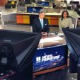
T.L. Hughes 746 Posted January 11 Share Posted January 11 (edited) 17 hours ago, Georgie56 said: KIRO has debuted, but they kept the bug from the previous package. KIRO: WPXI (this one a breaking news open): Edited January 11 by T.L. Hughes 1 Quote Link to comment Share on other sites More sharing options...
Georgie56 3059 Posted January 11 Share Posted January 11 WHIO has debuted as well. WFXT is on the clock. Quote Link to comment Share on other sites More sharing options...
MichiganNewsGraphicsJunkie 743 Posted January 11 Share Posted January 11 This was a huge upgrade for WPXI and WSOC 5 Quote Link to comment Share on other sites More sharing options...
T.L. Hughes 746 Posted January 11 Share Posted January 11 2 hours ago, Georgie56 said: WHIO has debuted as well. Quote Link to comment Share on other sites More sharing options...
TresGriffin 138 Posted January 11 Share Posted January 11 (edited) 1 hour ago, MichiganNewsGraphicsJunkie said: This was a huge upgrade for WPXI and WSOC Yeah, overall, I think this is an attractive package for the group, if not the most original. (Influences of both Fox and ABC’s new O&O packages are definitely apparent here.). One thing I’d like to see in the future is the ability to adjust colors and fonts to make it more unique on a station-by-station basis. The only place I think it’s potentially a downgrade is at WFTV, as the now-previous package was very nice. At the same time, it was getting long in the tooth too, so I can understand the change. And I also hope WSB goes all in on it soon, so there can finally be a cohesive aesthetic there because with the “old” opening and weather graphics (which don’t even match each other, let alone the new package) still in place, it looks like even more of a hodgepodge than before. Edited January 11 by TresGriffin 1 Quote Link to comment Share on other sites More sharing options...
Nelson R. 560 Posted January 12 Share Posted January 12 Just now saw this. Much needed upgrade. Quote Link to comment Share on other sites More sharing options...
MediaZone4K 1509 Posted January 12 Share Posted January 12 (edited) 21 hours ago, T.L. Hughes said: KIRO: WPXI (this one a breaking news open): Overall the new COX look isn't horrendus it's just inconsistent. Most of the graphics are 3-D, but a lot of the lower thirds are flat. Edited January 12 by MediaZone4K 1 1 Quote Link to comment Share on other sites More sharing options...
mouseboy33 39 Posted January 12 Share Posted January 12 (edited) I hate this package. The way the theme music has been chopped up and abrubtly cut off on some or quickly turned off. It doesnt even feel like COX anymore. They were always still the best at news opens and the correct timings and flow of the opens with the music and graphics. There were never rushed and they always had proper opens. Not these rushed anchor introduced 2 second opens most stations use today. These are just awful. IMO complete downgrade. Edited January 12 by mouseboy33 2 4 1 Quote Link to comment Share on other sites More sharing options...
MichiganNewsGraphicsJunkie 743 Posted January 13 Share Posted January 13 WFXT is live -- that completes everyone I believe Quote Link to comment Share on other sites More sharing options...
T.L. Hughes 746 Posted January 13 Share Posted January 13 (edited) 15 hours ago, MichiganNewsGraphicsJunkie said: WFXT is live -- that completes everyone I believe On top of this, WFXT also changed its news theme from "Stream" to "Guardian", becoming the first station to drop the former theme (former sister WHBQ is now the only one of the two stations that "Stream" was developed for that still uses the package). Technically, KLSR is the only Cox station that hasn't changed over, although its newscasts are produced by KVAL (so KLSR's broadcasts haven't switched to Sinclair's standardized graphics either). Edited January 13 by T.L. Hughes Quote Link to comment Share on other sites More sharing options...
Greggo 340 Posted January 13 Share Posted January 13 (edited) Boston 25 doesn’t tape their late news, do they? The morning and 5 opens say LIVE; the 10 open says NOW. Maybe it’s just an inconsistency… Edited January 13 by Greggo 1 Quote Link to comment Share on other sites More sharing options...
RegionalEmmy 1 Posted January 30 Share Posted January 30 Ugh! This package looks 8-10 years old already...really dated. 1 Quote Link to comment Share on other sites More sharing options...
Georgie56 3059 Posted February 5 Share Posted February 5 WSB is now using the new graphics in full, as they have debuted the standard open. 3 Quote Link to comment Share on other sites More sharing options...
ABC 7 Denver 1552 Posted February 5 Share Posted February 5 58 minutes ago, Georgie56 said: WSB is now using the new graphics in full, as they have debuted the standard open. This looks better than Scripps, which is saying something about Scripps Quote Link to comment Share on other sites More sharing options...
ATLNewsExpert 308 Posted February 5 Author Share Posted February 5 3 hours ago, Georgie56 said: WSB is now using the new graphics in full, as they have debuted the standard open. Still using the same weather package and open though. Quote Link to comment Share on other sites More sharing options...
MichiganNewsGraphicsJunkie 743 Posted February 5 Share Posted February 5 Sigh.. WSB always needs to stick out like a sore thumb.. If you're not going to go 100% with a new graphics package, then don't freaking use it at all.. The clash of packages is god awful... 1 Quote Link to comment Share on other sites More sharing options...
ATLNewsExpert 308 Posted February 5 Author Share Posted February 5 55 minutes ago, MichiganNewsGraphicsJunkie said: Sigh.. WSB always needs to stick out like a sore thumb.. If you're not going to go 100% with a new graphics package, then don't freaking use it at all.. The clash of packages is god awful... Using the intro and transitions helps a ton though, hopefully the weather graphics will change in the coming weeks. 1 Quote Link to comment Share on other sites More sharing options...

Recommended Posts
Join the conversation
You can post now and register later. If you have an account, sign in now to post with your account.
Note: Your post will require moderator approval before it will be visible.