Search the Community
Showing results for tags 'Gray'.
-
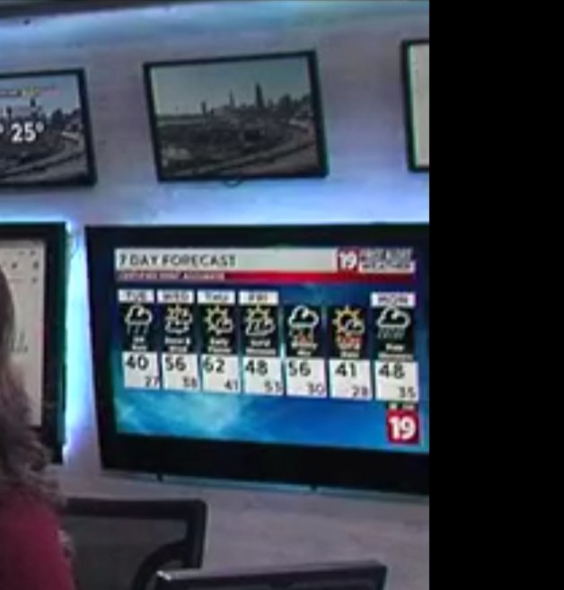
After almost 4 years, WOIO may be finally retiring the Raycom graphics package and the "19" is getting a major change. As seen during the 4pm newscast, here it is:
-
Recently (Thursday, Nov. 17), WHSV - serving Harrisonburg, VA and the Shenandoah Valley - debuted their brand new set that was designed by FX Design Group. It replaced their almost-two-decades-old set. https://www.whsv.com/2022/11/17/whsv-unveils-new-studio/ https://www.The Other Site.com/setstudio/whsv-2/ In case you're asking about their current logo, it's been around since 2020.
- 6 replies
-
- WHSV
- Shenandoah Valley
-
(and 5 more)
Tagged with:
-
It looks like WAFF in Huntsville is the latest Gray station to have their Raycom set demolished.
- 5 replies
-
- 1
-
-
- Waff
- huntsville
-
(and 3 more)
Tagged with:
-
After a few years, WMC-TV modified its logo and branding once again as of 4:00pm yesterday, going back to just Action News 5 without the call letters. Graphics have not changed. New logo: Previous logo: They have also adopted the slogan "Taking Action For You" after years of going without an official one on their newscasts (Only saying "With all of today's Breaking News, WMC Action News 5 at _____ starts now!") I do have my criticisms about the new logo: 1) They ditched the steamboat, which had been a part of the station's image for years. 2) The NBC Peacock is in the wrong spot (should be on the right side of the 5 instead of the left). It's like the 5 is about to EAT the Peacock. 3) The slanted box has been straightened, but they added a curve on the lower right of the logo, which seems unnecessary. Those are my two cents. What does everyone else think?