13 Eyewitness News
-
Posts
36 -
Joined
-
Last visited
13 Eyewitness News's Achievements
Assignment Editor (1/8)
14
Reputation
-
ABC changing their logo; New graphics coming for ABC owned stations
13 Eyewitness News replied to Briella's topic in Graphics
Finally! A station that knows those tiny icons are bad. It probably won't stop the pictures from not matching the icons though Just keep the icons and get rid of they busy and inconsistent pictures. Very much so. The circle 13 isn't even centered in the middle of the 'frame'. The "Eyewitness News" doesn't match the 13. It is too generic and simple looking to be next to such an intricate, unique Channel 13 logo. Eyewitness News is 3D while the 13 logo is flat. The tiny Houston isn't necessary because there's only one 13 Eyewitness News. "Tomorrow Morning" isn't centered with anything either. -
ABC changing their logo; New graphics coming for ABC owned stations
13 Eyewitness News replied to Briella's topic in Graphics
Just copying KTRK's new writing style of endless repetition. "Only on ABC13, ABC13's [name here] is live with the story," and "As we come on the air, we got breaking news...more breaking news...this breaking news is just in..." (Even when some of those stories broke 5+ hours ago, and everyone knows you are on the air. Someone has to hate that kind of writing as much as I do.) But in all honesty, of course I'm repeating the same things over and over, because every time I watch I keep see the same mistakes happen. I know people from that station used to seek out criticism, so that they could learn from their mistakes. So I figure if someone at KTRK still does, he/she will know that how many Eyewitness News viewers feel ad nauseam. I tuned into 4 primetime broadcasts at random times last week and within the first minute of turning Ch 13 on, they made at least one mistake each time. I also sometimes forget that I said something here before, because I've told the station some of it at one point or another, and posted other bits of criticism in other places. Sorry. And I'm not sure I understand this idea of standardized graphics anymore, because what KTRK has now is a hodge-podge of what they had before mixed with the lists, forecasts, the simple icons, font, and three dot, thinner banners from WLS. They still have same unique high and low pressure icons, which you guys hate, unique color tables for enhanced satellite, radar, etc, the 4-TowerCam view with current conditions, the same flow lines, some full length banners like before, the same current conditions on the banner (expect a lot smaller) and in 3D (the same size as before), the same transitions, and as well the same way weather alerts pop out under the top banner on radar and the banner still changes from blue to red like before. Pretty much everything on the left hand side of the video wall is the same and augmented reality still looks the same. On the other hand, they removed one of the station's colors, red, from nearly everything. For some reason, the satellite picture in the background of Mega Doppler 13 and FutureTrack is a lot darker than before, and doesn't have the same level of contrast between the background and everything else. They even got rid of the Mega Doppler logo, which doesn't make sense since the station spent a pretty penny on that radar. So, yeah, even though I don't like it, the package at WLS is much better done in that it was clearly designed for them and everything seems to be an appropriate size, while what's at KTRK looks like a rushed copy-and-paste job with changes that don't make sense which make things a lot less legible. -
ABC changing their logo; New graphics coming for ABC owned stations
13 Eyewitness News replied to Briella's topic in Graphics
That how I used to feel about KTRK's 6&10pm broadcasts up they started making bad decisions like the elimination of 13 Undercover, whatever or whoever made their former news director Dave Strickland to quit, and of course, pushing Dave Ward out. Strickland was the best ND that station ever had. He lived, breathed, and bleed Eyewitness News when he was there. Reading things like this, really gets me: "They don't let you in the building and they said they were busy and would call me back and never heard from them. Marvin [Zindler] would be ashamed of them." --Google Review, a few hours ago KTRK used to have "CrimeTracker-13", and just like Action 13, 13 Undercover, and 13's HealthCheck, got rid of that too. The "Safety Tracker" thing is such a rudimentary version of what they had 15 years ago, in part because it only covers one county, and because they rarely ever use it on air. I have to concur. The lower thirds have too many movements during live reports. And what's up with using 2D logos, but having 3D graphics? To warp it up, boy if you wanted proof that one size doesn't fit all, just look how tiny many of the fonts on the new weather graphics at KTRK. People have been complaining that they literally can't see some of it because it was designed for a greenscreen, not a full-body video wall. Giant spaces for the weatherman to stand are still there, though they don't need them, so everything is pushed into one corner in some graphics and proves less info than before. I am so disheartened to see that ABC OTV doesn't even care enough to put out a product that people can read on smaller screens or for people who don't have perfect vision, and that has a forecast that so busy, harder to understand, see and remember. None of the sky images looked anything like those pictures would have led you to believe (very dark brownish-looking pictures vs a pretty much clear partly cloudy blue sky with a tiny bit of haze). No question, what they had before was better. -
ABC changing their logo; New graphics coming for ABC owned stations
13 Eyewitness News replied to Briella's topic in Graphics
Great article! Yeah, I was off by a couple years. How ironic, because KHOU still has the reputation for being cheap, especially ever since Tenga bought the station. I was going to say "Some things never change," but I swear that was in old line in one KTRK's promos that said they were number one for decades! Dave Ward, and as the article noted, Marvin Zindler's Action 13 helped that station make that station what it was. For those that don't know, Dave was the reason Channel 13 hired Marvin, and Marvin is the reason why fighting-for-the-little-guy became a thing on TV news. Shortly thereafter, they became number one in this market for around 25-30 straight. They used to care so much about presentation and content, but boy have things have changed now. If I remember correctly, Eyewitness News Tonight (at 10pm) finished third place in the November(?) sweeps a year or two ago. That's where they started before Dave and Marvin--last place. From the article: LOL! Someone literately said that KTRK needs better reporters because their new ones like what you'd find in a "high school film class." How many people does it take to spell "Eyewitness News" correctly? Well, it depends on who is working. Is it "Eyewitrness News", "Eyewiness News", or "Eyewtiness News" today? Someone put up a "BACK TO SCHOOL" tab on the lower-third for a warehouse fire, and never took the chyron off the screen for the entire live shot. They make so many mistakes now that it makes me sad to watch a broadcast that used to be nearly perfect. -
ABC changing their logo; New graphics coming for ABC owned stations
13 Eyewitness News replied to Briella's topic in Graphics
Tenga finishes last place in our market most of the time, so they don't have as much to lose here. But KTRK-TV has already lost viewers for a lot of other reasons than graphics. In the May 2022 sweeps, KPRC Ch 2 became the #1 station in the market for the very first time in over 5 decades. That's the very same station that has been trying to copy Channel 13 for that very same 50-year period. When you loose to an imitator, you've must have stopped being an innovator. -
ABC changing their logo; New graphics coming for ABC owned stations
13 Eyewitness News replied to Briella's topic in Graphics
I saw it on air, and it's worse than I thought it would be. It is easier to read these graphics when they show this package on the greenscreen at WLS than on 13's weather screen. But regardless of where you show it, the fonts are still smaller on most graphics. The 10-forecast is much, much harder to read on this screen than the 7-day on a greenscreen. This is taken from their website, and hopefully, will post as the same size. It's TINY. I thought the 7-day looked bad, this is so much worse because everything is too small and too spread out. WLS' version looks a lot better than this.
-
ABC changing their logo; New graphics coming for ABC owned stations
13 Eyewitness News replied to Briella's topic in Graphics
Channel 13 used to welcome people calling their newsroom for comments, complaints, and criticisms. I really do care about Channel 13, but like many Eyewitness News viewers in Houston, feel betrayed by a station that stopped caring about us. I just want to say that that station probably gets more hate mail/negative comments these days than any other Owned station. You probably won't believe the kind of hate they've gotten recently. A few days ago, someone just told them that they should "dig" Channel 13's "grave". A year ago this month, which marked the 15-year anniversary of Marvin Zinder's death, someone else said that KTRK has desecrated the legacy of Zindler and Eyewitness News. He went on to say something like this: When there are more people in need of help than ever, you help fewer people than ever. I believe the viewer noted that Action 13 only helped one person in all of June and July of last year, or something like that. Sadly, it's pretty much the same this year too. You don't know how much it breaks my heart to see a station I grew up with be trashed like that, and even more so for Channel 13 to not listen and understand that the viewer was right. (They used to have a number used to just go to the newsroom, and there was a different number for the breaking news tipline. They replaced it with just that one phone number.) Well, a lot of people in this market will turn off Channel 13 for good if they downgrade their graphics. They have already gotten dozens of complaints telling them such, and it hasn't even happened yet. I'm am sorry to cause a stir, but the people who made this package--and the people who are pushing it--should want to hear all feedback: good, bad, and ugly. That's the only way you can improve. I know Tracy Butler at WLS was nice enough to give many complaints to Vivid Zero, but the company hasn't listened to any of the constructive criticism. Good for her for caring. Again, I'm sorry. Maybe now you'll better understand where I'm coming from. -
ABC changing their logo; New graphics coming for ABC owned stations
13 Eyewitness News replied to Briella's topic in Graphics
That was just one small point I was making, and you ignored every other one: The bigger point was that a graphic at GMA couldn't even fit triple digits, their high pressure symbol doesn't have arrows around it, but it has a useless circle around it, and there is no word "HOT" or red color gradient on the graphic, it doesn't say "heat dome" or anything else. Thus, it's a poorly done graphic I'd expect to see from a small market station in the middle of nowhere, not ABC News. It's too basic. You don't need a red H. You need something, anything at all, that conveys that it will be hot. Why don't you call the Eyewitness Newsroom at [redacted] and ask why they have a red high pressure symbol? They aren't going to tell you it was for the fun of it. Some other stations just take the H symbol away and put the words HOT or HEAT DOME in place of the H symbol. That's enough arguing over that. Just to let you know, I've spoken to some current and former meteorologists at two Owned Stations and none had anything good to say about the VividZero weather package. Maybe this is the greatest thing WLS has ever seen, but it certainly isn't an improvement in other markets. It's not even good. At WPVI, they got dozens and dozens of negative comments once the change was made, and still, months after the debut, still get negative feedback about the package, especially the forecasts. That's what I care about more than a red High. Clear, unique, and easy to understand graphics that appeal to everyone--not just people who like weather apps. -
ABC changing their logo; New graphics coming for ABC owned stations
13 Eyewitness News replied to Briella's topic in Graphics
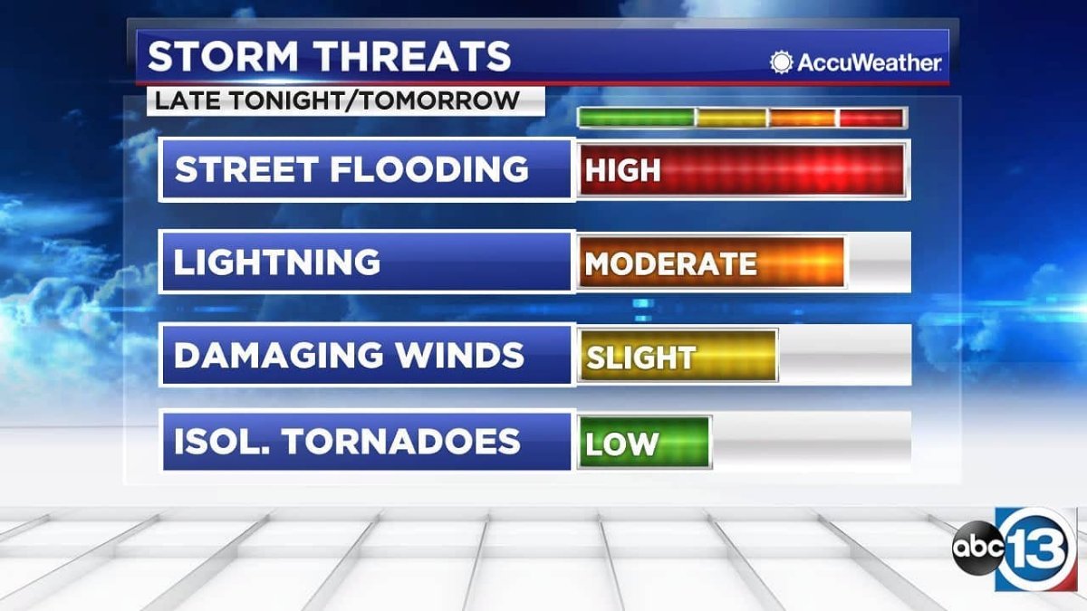
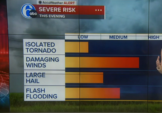
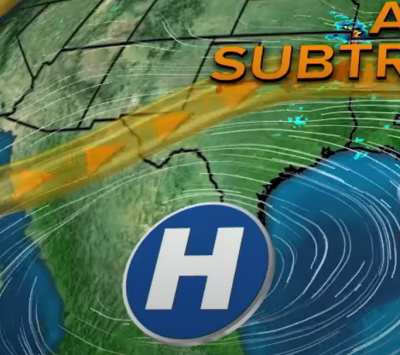
Just read this from a small market station and it will help you understand the difference: https://abc17news.com/weather/2022/01/26/insider-blog-what-is-arctic-high-pressure/ Let's get back to the new graphics... Just compare these risk outlooks from KTRK and WPVI. Which one is a better visual representation that viewers can remember more easily? The 'improved' version isn't listed in ascending order, isn't color coded, and has bar graphs that are all over the delineations.The isolated tornado bar looks like a mid-to-high end low risk, damaging winds could be a lower-end high risk or a high-end medium risk, etc. It's just poorly done and much harder to remember at a glance. KTRK's way is labeled on each bar, color coded, listed from highest to lowest risk, and each bar goes the full length of the delineations (4 vs 3 for new package). This isn't an improvement. It's a downgrade. I should correct something: Hothaus Creative didn't not make the weather graphics for KTRK; they made current and prior news packages. It was their former Chief Meteorologist Tim Heller who designed the weather graphics. Tim used unique color gradients for radar, enhanced satellite, rainfall, dust-casts, etc. (I don't know who made the red High though). The package made by VividZero uses the same green, yellow, and red color tables for almost everything. It's just too basic.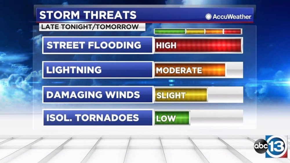
-
ABC changing their logo; New graphics coming for ABC owned stations
13 Eyewitness News replied to Briella's topic in Graphics
That's true for a cold-core High, which is more common in the winter. In the summer, along the Gulf Coast, we get warm core High pressure systems. As I said before, the sinking air compresses at the surface, and that gives you high temperatures when high pressure is in control in the summer. The high pressure acts like a dome and 'caps' the atmosphere. Hence the terms, heat dome or heat ridge. That's all Channel 13 is trying to do--show people that there's a difference between an arctic high and a summertime warm-core high. -
ABC changing their logo; New graphics coming for ABC owned stations
13 Eyewitness News replied to Briella's topic in Graphics
That could explain why I started seeing some of those topical system icons on another station in the same market. -
ABC changing their logo; New graphics coming for ABC owned stations
13 Eyewitness News replied to Briella's topic in Graphics
WSI rang a bell. Some of the station's graphic elements are designed by IBM's The Weather Company including "Max Reality," which is augmented reality. (KTRK was one of the first stations to use augmented reality.) KTRK does change certain elements quite often and they seem to mix a lot of things together, so I can't remember how long they've been using that closed center Low. They use Baron Lynx's radar display and has that 'exclusive' (in the viewing area, at least) product that can detect hail in a storm. They've probably used everything that's available to them expect for Accuweather at one point or another, and I guess that what gives it the more "custom" look. The main thing I don't like about the GMA graphics was really that it couldn't fit triple digits and if you put a surface low pressure's L icon on a circle, without showing the spin, it makes it look like a closed center of circulation, even though it isn't. Okay, please tell me why are KTRK's colors that way? Is this not a depiction of a ridge of high pressure, its so-called "Ring of Fire", and the bump in the jet steam because of the high? I know showing a high pressure in red is "wrong", but they didn't make it red for the fun of it. -
ABC changing their logo; New graphics coming for ABC owned stations
13 Eyewitness News replied to Briella's topic in Graphics
I didn't realize this would cause such a stir. I know that the typical colors are red for low pressure and blue for high pressure. It's also typical to show a low pressure system in the gulf as just the standard L, as shown in your picture too. But, how do you show the difference between a tropical low, that has a closed center of circulation and one that's doesn't? The former can become a tropical system, while the latter can't. KTRK shows it with a (L), a circle around a red L, as seen in the video. I don't know who made it, but KTRK has had similar looking red High pressure icons in their last 3-4 weather graphics packages, which were all made by Hothaus Creative. They do use the regular blue highs/red lows in the winter to show the upper air pattern. But the station does a lot that isn't "normal" and I always like that. We have color gradients that go up to 20" of rain. Might sound crazy, but that's happened many times in SE Texas. As seen in the video, we also have different color gradients for tropical weather, which don't look like regular radar reflectivity as there are no radars in the middle of the ocean anyway. Is this unique too? I've always hated seeing green/yellow/red color gradients on tropical systems because you aren't measuring the intensity of the rain without radar, you are only showing an enhanced satellite picture of clouds. It's the way KTRK has been doing it for at least 10+ years. The map depicts the upper air pattern and temperatures aloft. The former is shown in the flow lines, and the latter with all the red around the map. The H, clearly, is high pressure, but is depicted in red to convey that it's a 'heat-ridge' and shows the way it spins--clockwise. You're trying to show life-threatening extreme heat here. A good weather graphic should tell the story just by glancing at it, and teaches viewers why what's happening is happening without saying a word. A high gives you sinking air, light winds, and clear skies. In the summer, that allows for maximum heating--and in this case dangerous heat--during the day. While in the winter, that same high will give cold temperatures because of a lack of cloud cover. -
KTRK started reairing a few old stories in the past few months. I think the station believes that people can't remember. KTRK used to have a HealthCheck reporter, but after she retired, the station got rid of HealthCheck. They also used to have a "community journalist" and he left as well, but he wasn't related to Bobby Flay! We do have a SkyEye-13 reporter in the morning, but she doesn't actually work for Channel 13. She works for Helicopters Inc, which owns the chopper. Well, now I can see that. I was assuming that other O&O stations also slashed key positions, but that doesn't seem to be the case.
-
ABC changing their logo; New graphics coming for ABC owned stations
13 Eyewitness News replied to Briella's topic in Graphics
They are much better at designing websites and magazines than news graphics. I guess that's why they tried to make some graphics look like web pages with tabs/arrows, tiles that swipe the screen like you would on some apps, and ellipses marks on banners that look like a more options icon. I was watching part of GMA this morning and noticed their weather graphics, which look a lot like WLS', aren't optimized for hot weather and triple digits. They tired to show three one hundred degree days in a row, and it looked like 101100101 instead of 101 100 101. Even the weather lady said it "looks like a serial number." The ridge of high pressure was your basic white and blue and didn't show the clockwise spin around the H either. That high pressure, which has sinking air, is the reason for the hot weather and KTRK's way of depicting it much better with a red high, which does have the clockwise arrows that spin around on the H's circle and red color gradiant all over the map. Both of those elements makes it look hot and color of the High tells you why it's hot. Whereas a blue high looks cool, and with no arrows, you don't even teach viewers which way high pressure spins let alone convey that it's the reason for the heat.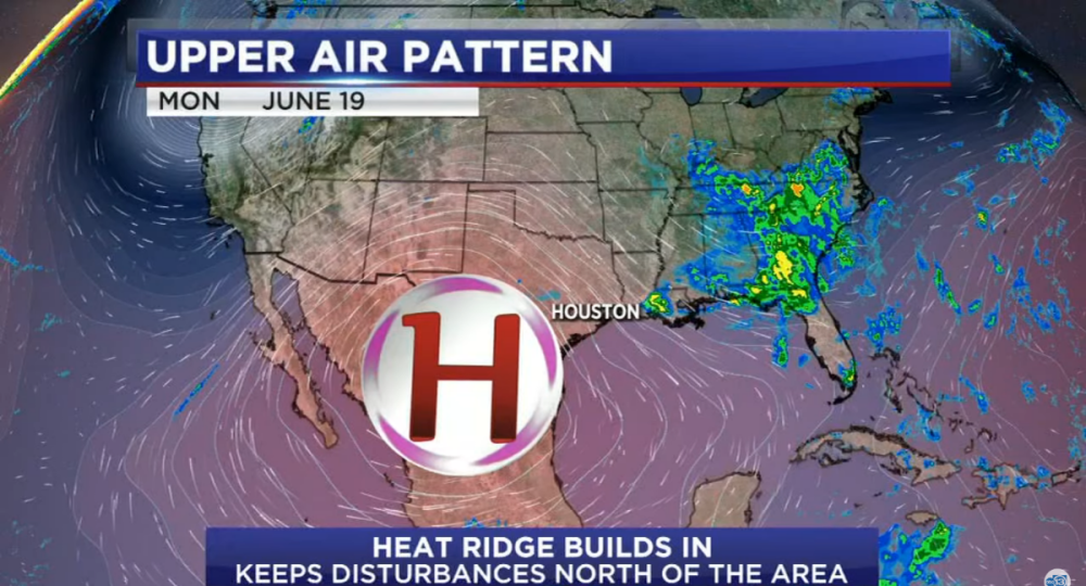
.png)