CTrey98
-
Posts
51 -
Joined
-
Last visited
CTrey98's Achievements
Assignment Editor (1/8)
26
Reputation
-

BREAKING: Warner Bros. Discovery Leaving RSN Business
CTrey98 replied to Georgie56's topic in Sport Center
Not a good move from a fan prospective. The MLB does better than Bally's when it comes to producing the broadcasts, but their pay to watch structure has been a pain for DBacks and Padres fans. Rockies fans will experience the same thing. It's just as bad as Bally Sports. But with Baseball, TV deals have to become more expensive so teams can build up a higher player salary. The Dodgers are able to build a super team because of their TV deal with Spectrum. The MLB at some point needs to enforce a salary cap if they don't want to lose fans. That way, teams can cut an easier deal with local TV stations so games will be a more available to watch on TV. And it will be more competitive across the league so teams like the Dodgers don't reach the World Series every year. -
general thread NBC Sports/NBCSN/Golf Channel/NBC RSNs Thread
CTrey98 replied to WCAUTVNBC10's topic in Sport Center
That's odd. I just watched NBC broadcast the All-American Bowl which used the new College Football/Basketball graphics so that look is definitely not tied to the Big Ten or Notre Dame exclusively. Makes no sense why they would do this with the Atlantic 10. Basically shows that NBC Sports views that conference as lower production value. -
Not a big fan of the look. So many things to touch but I'll keep it short. I like the fact they are trying to go for a clean futuristic feel but it's just executed horribly. If you're going to a super wide scorebug, at least find a way to put the school logos in with all that space. Another annoying thing is the network logo placement, I don't get why networks like NBC do this but you shouldn't have your TV logo in the scorebug and as a screenbug in the top right corner. Makes it look repetitive and a mess. Just make up your mind and keep it in one area in order to keep it simple and effective. The last thing is the font, not sure why they made the clock use a skinny font and the period and shot clock bolded. Makes it very hard to see for viewers. Overall, they definitely have some work to do but at least they are finally going their own creative direction. I'm glad to see that the ESPN graphics was just a temporary solution just to get their ACC broadcasts up and running in a short time frame.
-
First Rockets telecast on Space City Home Network and they are apparently carrying over the AT&T graphics package with them. Highly doubt this is permanent since the logo doesn't fit the scorebug very well. Maybe they are just buying themselves time until the regular season or at least until next baseball season.
-
Bally Sports is a sinking ship at the moment. The Coyotes are just the first of many NHL Bally affiliates starting to leave. The network made the games impossible to watch. Very few TV providers to get it from and a streaming service that is too expensive and not worth the price given the technical quality and network IP the brand had to offer to the average fan. Not only that but with the Suns going to a OTA station like KTVK, if fans had to choose between two teams playing at the same time, you better believe they'll go for the one that's free to watch in the area. Although this station is a subchannel, it has the capability to reach a bigger audience than Bally's because of how easy it is to access.
-
Actually, this look from 2015 was pretty good. Had a lot more team colors and logos added to it. They should've kept this style and modify it but instead, they dumbed it down way too much.

-
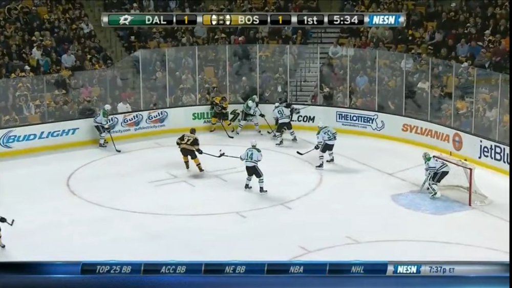
Not a shock. Like I said with the ACC deal on The CW, there was no time to put together a new package. Once they announced that NESN would take over their operations, it was pretty obvious their look was going to be like this. AT&T SportsNet literally pulled the rip cord on them so they had to act fast if they wanted to keep the network on the air. Maybe they'll change their look next season. NESN definitely needs an upgrade anyway. Their look is way too boring. Either way tho, I can definitely see NESN and SportsNet Pittsburgh using the same package no matter what going forward.
-
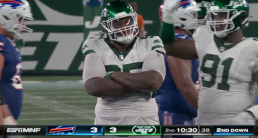
Really liking the new graphics and scorebug for Monday Night Football on ESPN. Not only did they go back to the neon feel, but it's much more improved and cleaned up. And on top of that, they removed the yellow venom which is a step up. Not surprised tho that they kept the same bottom bar layout taking up the whole screen. Given that they will broadcast Super Bowl LXI in 2027 and since they have a common pattern of changing up their look every 4 years, it wouldn't surprise me if they wait until that Super Bowl to make any dramatic changes to the scorebug as well as their entire graphics look.
-
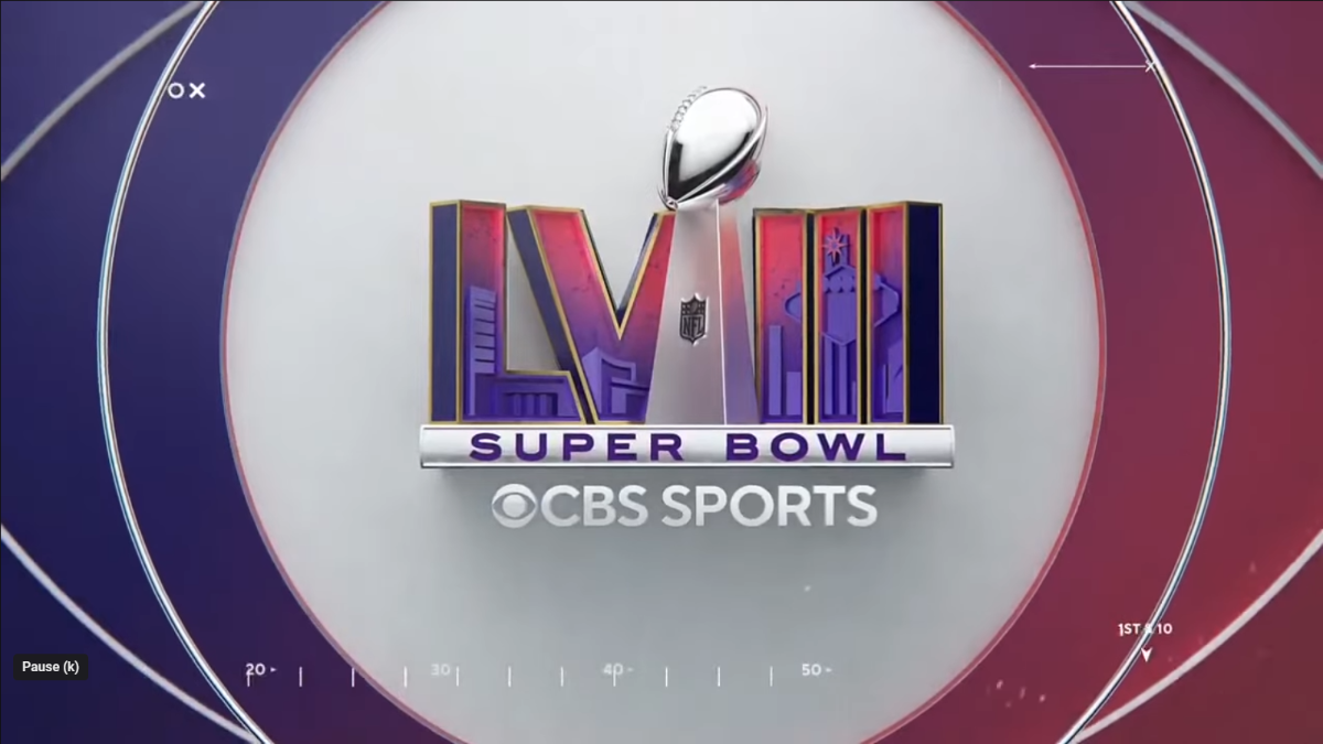
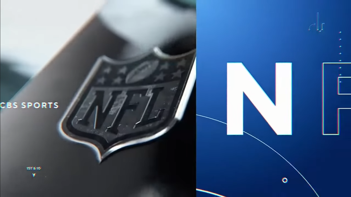
First tease for CBS's upcoming broadcast of Super Bowl LVIII seen in the NFL Copyright id before the start of every game this past Sunday. Not sure why it took me so long to notice this, but this is the first Super Bowl network logo to have CBS Sports in it. Not just the original CBS logo. Probably to imply their game will have two feeds with Nickelodeon doing a separate broadcast. Obviously no hints they will debut a new graphics package yet since this graphic is the same exact template they used for Super Bowl LV. I would think they will rebrand since their scorebug is aged out the most compared to all the other NFL broadcasters.


-
It's no secret Nexstar is likely running tight budget with The CW since they are trying to make the network profitable again. So it makes sense they wouldn't want to go over budget just to create a full graphics package for their College Football telecasts in a month and a half. They'll eventually do their own graphics package when they get to year 2 of the ACC telecasts. They just need more time to create a full graphics package. You can't rush perfection, unless you're willing to pay a lot for it.
-
I don't think so. They used the Bally graphics when this package aired on Bally Sports last season. Plus, they are using their own full screen graphics and their own theme music. My guess is, given they announced this deal Mid-July, they probably didn't have enough time to put together a full graphics package since they only had a month and a half to make it happen. Using the ESPN inserts is probably just temporary for this year or maybe just a few months. Curious to see how this will work for ACC Basketball since ESPN have a different graphics look for College Hoops. I wonder if they will do the same thing there.
-
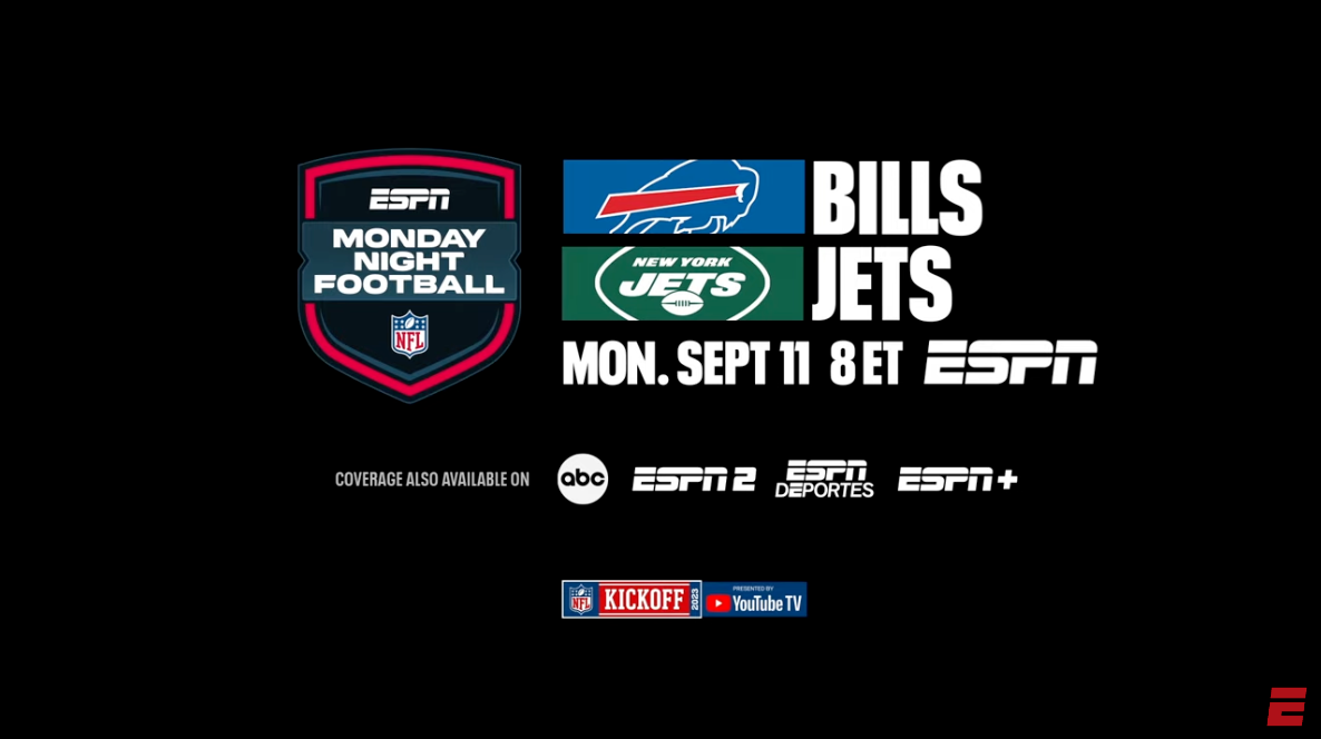
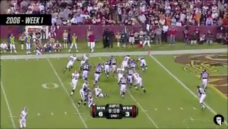
Saw this promo by ESPN advertising their Week 1 Monday Night Football game. Looks like they will debut a new updated logo for MNF this year. This obviously means they will have a new graphics package this year right? Curious to see what they will do. Wouldn't be shocked if they did a remastered version of the 2006 scorebug. They technically we're the first to do a bottom center scorebug way before it became a on-going trend for other broadcasters in 2020.

-
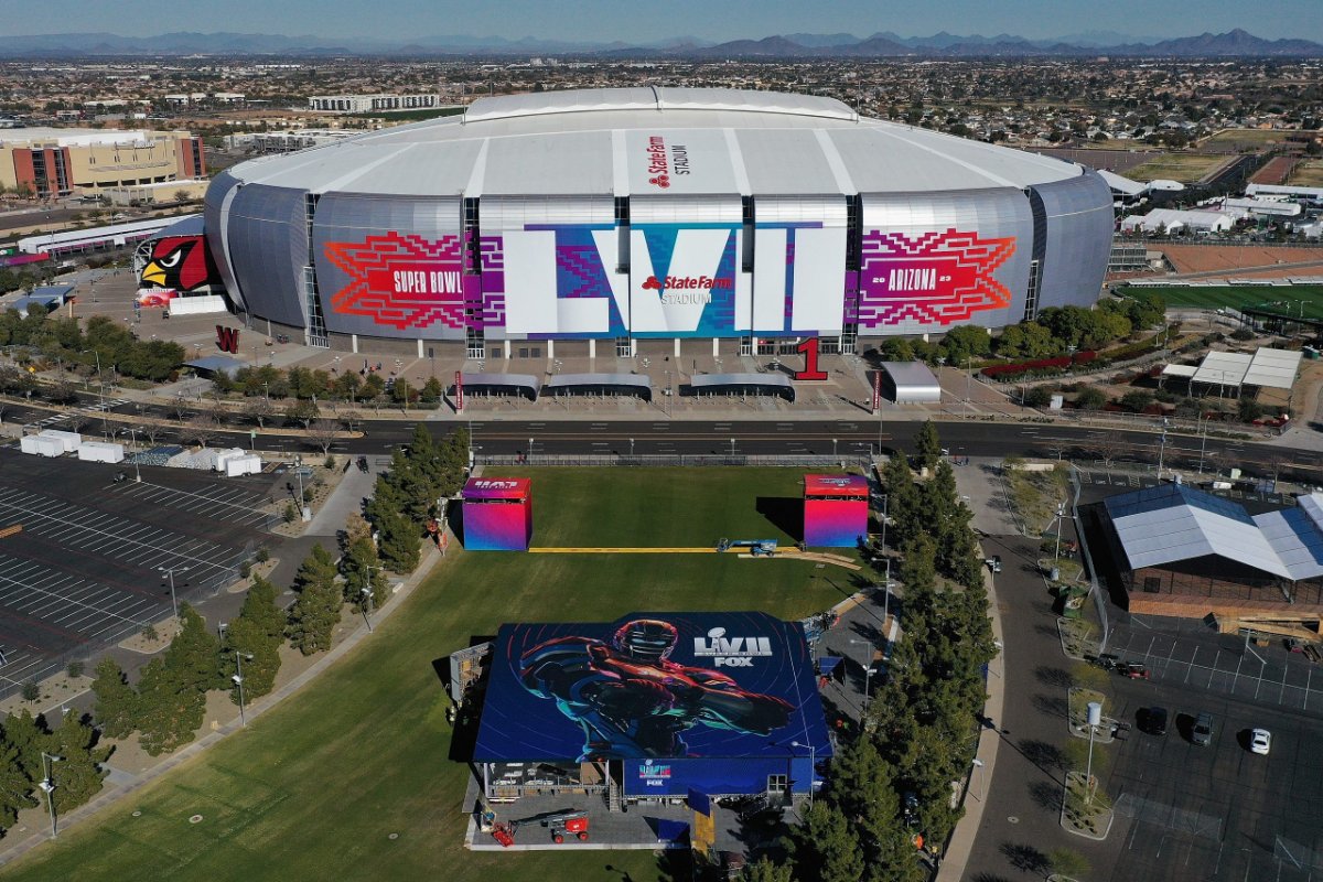
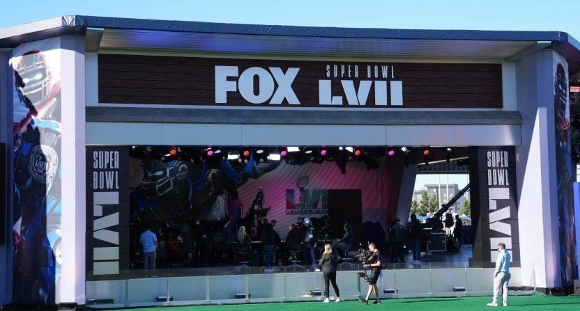
Sneak peek at the studio setup location outside. Sounds like they are only doing two studio setups for game day coverage instead of three. This set looks like a downgrade compared to when they broadcasted Super Bowl LIV in 2020. Looks smaller than what they did before. At least the backdrop will look awesome for the camera shots.

-
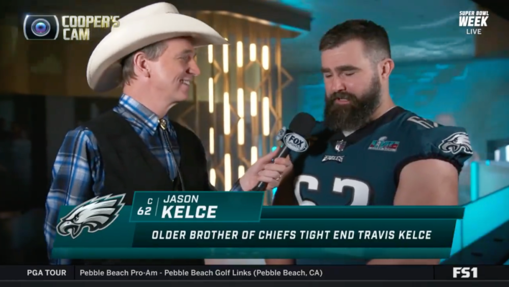
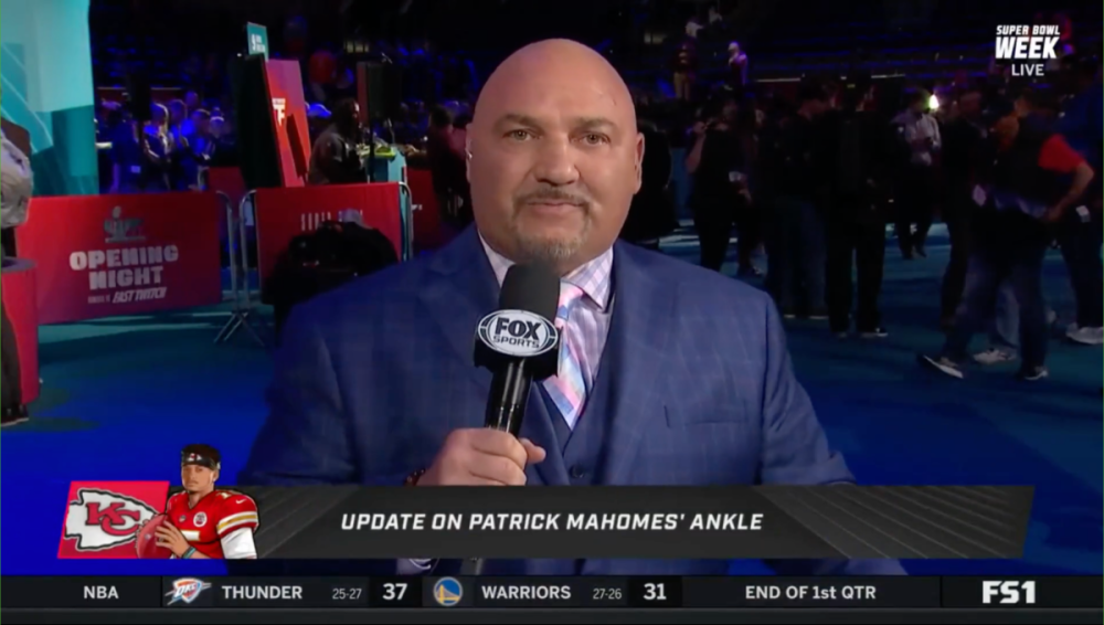
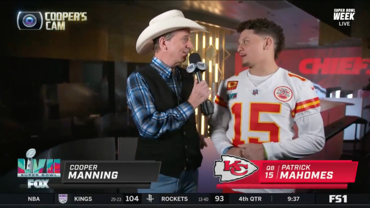
Not a shock, FOX Sports is still using their recent football graphics package as part of their Super Bowl week coverage. Looks like they are going to wait til game day to do a full reveal. They did this the last time they broadcasted the Super Bowl in 2020. NBC and CBS have also done the same thing in the past two years prior when it comes to waiting til game day to launch their new graphics.