


Vidifont
-
Posts
38 -
Joined
-
Days Won
1
Content Type
Profiles
Forums
Articles
Posts posted by Vidifont
-
-
So Tanchek gets on the air to warn everybody that he's going to create a First Alert because bad weather will be here in two days. Two days later the First Alert fizzles into
a small storm with showers. They have made the weather on WOIO unwatchable especially when they almost shout it at you.
-
 2
2
-
-
WOIO's weather is nauseating. Power planner, First Alert and all the other BS. They yell the forecast at you. It's a tune out factor big time.
Tanchek is the worst, as soon as I hear his voice, it's goodbye. They are trying to reinvent the wheel. People in Cleveland have lived here
since the 1950's without that kind of treatment from broadcasters. WOIO yells the weather world is coming to an end next Tuesday. The other stations
treat the viewers properly. No disrespect but Gray Television can take their way of doing things back to the small markets. It won't work here.
-
1
-
 2
2
-
-
Sorry if I confused you all. Yes time and temp should be there between 7 AM and 9 AM. Not everyone is walking around with their phone constantly.
It can be done right and not be obtrusive. The problem with WOIO is their current incarnation of their logo is too big on the right side of the screen. Time/temp
can't fit with CBS Mornings new graphics.
-
1
-
1
-
-
Since CBS Mornings debut, there are new graphics but WOIO has no time/temp anymore. I would assume they need to get the
chyron to reposition that to match the new graphics. Very annoying to watch when you want a quick look at the temperature. I guess
they'll fix it just in time for CBS' new morning program retool in 2024.
-
 1
1
-
-
Just saw WOIO's Samantha Roberts and her 19 First Alert WX BS with Lake Erie green and Cleveland in blue. Later the lake is blue and the land is green. ???
-
Just tonight on CBS' debut of the CBS Special Presentation animation before Frosty the Snowman got covered
up by WOIO's wonderful on crack engineering department. They covered up with first few seconds with a Carvana commercial.
I recorded it and sure enough, they screwed it up.
Before this tonight there were running a Spectrum spot with digital audio buzz for a few weeks. I swear no one at that station watches
the on the air signal.
-
Hopefully everyone on this has calmed. The new name has been slightly if not at all noticed by
the audience. It's a clean sweep for a move to a new studio. The content of the program has not
changed other than one anchor. A nice update that sits well. The use of the Sunday Morning music
theme integrated for every morning show works. The audience knows this music as it has been used
for over 42 years at CBS. "CBS logo" bug resize and realignment is interesting. Just need to get affiliates
to time and temp update.
-
4
-
-
Can't forget The CBS Morning News with Sally Quinn and Hughes Rudd from 1973.
-
3
-
-
The new thing now at WOIO is when they go from CBS to local, the switch in master control causes a 2 second
audio/video drop. It's asinine and has been going on for years. So when they leave the CBS Television network and transition into
the local news at 11, (wait), master control hits the switch so 19 Action News starts and then when the anchor starts to talk, the
2 second dropout occurs. The place is a joke.
The anchor who is stays off set look likes a fool. Great stories, but this is the worst production
in the USA. Even United Artists TV and Gaylord would cringe at this.
Also asinine, they are back to the time/temp top of the hour with no time/temp!!! HAHAHAHA! Why do a time temp if you can't do it?
Lazy ass station. COVID is not an excuse anymore. Lazy staff.
-
WOIO has preempted CBS This Morning this morning and there really is no need to. Cleveland did not get the snow as expected. Once again, WOIO
is a joke. Last week they did a complete story with anchor Tiffany Tucker, her narration showed an empty studio chair for 45 seconds. This place is a
dismal television station in a market that likes CBS. Losers every time they are the air. We are going to start doing shots when they screw up. Big fun awaits.
The engineers don't care. Life in a basement.
-
4
-
-
The technical difficulties are to the point where you can't keep tabs. The place is a mess. Anchors don't know what day it is, reporters
are doing the best. Sports at 6 is the same at 11. It's a repack house.
Producers are so lame, Thursday at 6, towards the end of the broadcast they ran a CBS Norah O'Donnell custom with
Tiffany intro at 27:00 in the hour. So the viewer gets the nauseating headlines that we will see 3 minutes from now, AGAIN! The station is a waste
case and the CBS Television Network should find a new station if possible. The worst television news I have ever seen, pandemic or not, WOIO sucks!
-
Again, 2 minutes of headlines just cut in on story time. When does the insanity end? And you care about 4:3?
-
 1
1
-
-
7 minutes ago, ns8401 said:
I felt like they gave us every story in the newscast in that teaser...
Yes, and Nora at CBS bragged at her inauguration that she was proud that the headlines were reduced down in time in
an interview. CBS is now at point where it's worse than ABC. Lead with the lead. Let the reporters tell their stories!
New idea, Nora does the headlines from Washington and John Dickerson anchors the show from the Broadcast Center.
-
1
-
-
What happened to giving the audience the news now? No wait, we'll tell you the stories in 2 minutes, but first this. The producers who produce these
opens have taken it too far. The only broadcast that does it creatively is CBS This Morning with "Your World in 90 Seconds". Everyone
else is just wasting the viewers time. It's old hat and ridiculous.
-
3
-
1
-
-
Just to be clear, I am referring to the 1978 Newscenter 8 set.
-
On 5/5/2020 at 10:20 AM, 5OnYourSideMan said:
For WJW there are these sets. The one who made these sets is a mystery.
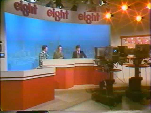
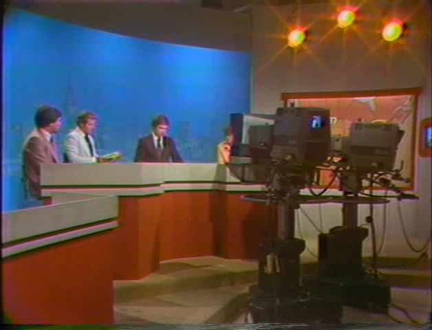
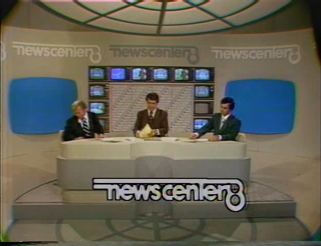
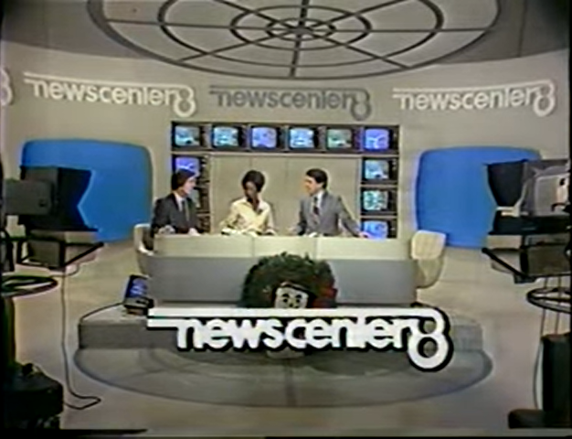
The Newscenter 8 set was designed by Hilton Murray, Art Director at WJKW. It was built by a local union shop that made department store displays in Cleveland, Ohio.
-
2
-
-
On 9/23/2019 at 9:49 PM, Samantha said:
This is one of the most polarizing TV rebrands this decade, but gosh...
I know Tegna takes a lot of flack. This is a company that, hell or high water (and with good intentions), is trying to reshape TV news. But this is a new level of that. It actually feels like the maximum expression of the Tegna philosophy to presentation.
It feels like a big gust of fresh air. The logo is polarizing (and very very UK Channel 5-ish), but it's a creative direction with oomph to it (the teasers feel like a Euro-style ident package). In TV news, people are scared of massive leaps of change because they fear effects on stations' older viewers, even moreso in markets that aren't fast growers like Cleveland. Tegna lacks that compunction.
This may end up being a rebrand that earns more critical acclaim than mass appeal. It's ambitious on a level almost never seen for affiliate rebrands. There are some networks (ABC, in particular) that would have never let this fly.
This is making me think particularly of the NBC "city name" branding that never went beyond San Diego, but arguably was in hindsight a forward-thinking nod to the declining importance of channel brands in an overall station identity (particularly on social). It's not Boston 25—that was a unanimously derided downgrade.
So what are you saying? You sound like you are talking at a fashion show. It's TV News!
-
It's amateur hour at "Circle thin 3".
-
3
-
-
On 9/19/2019 at 7:11 PM, JosiahCubed said:
Why does almost everyone on this forum hate simple logos like this?!? Personally, I find it aesthetically pleasing; plus it could have a variant with the NBC peacock.
You all need to realize that this logo is much more pleasing than something that's had thousands of effects thrown on it. *cough* Univision's 2013 logo *cough*
I'm a graphic designer, I would know.
Because it's thin and does not pop! Not comparing to Univision, that's a joke. WKYC's logo will be lost. It is terrible.
-
2
-
-
It's terrible. It does not stand out at all. This is the fact that management is lost. The thin logo, complete failure. They also
went back to the Orange paint for the newsroom that they used when the station debuted in the building in 2001.
I guess they had some extra paint cans in the back. This is completely unacceptable and the logo is... ?
CBS Evening News
in Network News
Posted
The CBS Weekend News from the Broadcast Center looks so more refreshing than the plasitc show Norah puts on. Just close that studio and bring everybody back to New York. It's a waste of money and time. It also lends credibility.