ns8401
-
Posts
2871 -
Joined
-
Last visited
-
Days Won
20
ns8401's Achievements
Station Group CEO (8/8)
846
Reputation
-
It was actually Saturday 4/20.
-
That might have been the idea… their 2000’s graphics package circle 7 spun like that.
-
Well… they got some nifty new preview graphics in a light blue color: Also a new background for use in a multiple person box, not sure how well it shows up but it’s using some of the same light blue color. They’ve had the blue on their jackets for years now. It’s about the same shade that Honda uses for its commercials. Lower Thirds are the same. Sports sponsorship bumper showing new sports logo: 11pm Open complete with some actual movement with the logo: 7 News Detroit Sponsorship Bumper:
-
They been stuck in 2nd since 2009 overall and third in the demo… they have nothing to lose.
-
I hate to break it to you but all three major stations in Detroit will have now rebranded at least once. It happens. Folks in this market seem to like the hype of WDIV and absolutely nothing 7 has tried seems to work. They have been stuck in second since 2009 and there for 22 of the last 28 years. Even though their newscasts are really well put together now they spent years in the doldrums quality wise and never really followed the format to begin with even in the 1970’s. Their newscasts weren’t so different from KABC or WABC or WLS that we should say they reinvented the ABC local news wheel. It’s not the tradition it is in Philly or something either. If it means better graphic elements and a new voiceover and maybe talent opens and a new style that’s probably a positive on aggregate. Their focus is gonna be on using 7 and Channel 7… they don’t even have a slogan anymore. I’m looking forward to seeing what they come up with.
-
If you tweak the name and leave the product exactly the same or nearly so… will anybody notice? That’s what I think they are up to.
-
Thanks, I knew you would know it. First image from the News era I could find and it took a minute to come up with one.
-
Correct WJBK beat ABC to it in Detroit so they adopted the other name but it left their product somewhere in the middle. It was unique among the original 5 stations in that way.
-
They always had the same style as KABC or KGO… they never really followed the Action News format… it always looked like Eyewitness news with a little more relaxed freewheeling style. Then they got lost after bonds left and adopted a WABC-ish caricature that was actually really good in the 2000’s before falling off a cliff from say 2011 to 2021. Currently they have gone way hard news with very little hype… this new branding fits pretty well with what they are doing and the improvements they’ve made to the product. Their newscasts could use to be a lot less sleepy though. There isn’t any flare at all for whatever reason. Not even the kind that you can do for free by changing or tweaking style. The logo looks like something one of the O&O’s would make when they had dropped the Eyewitness part of the name… at least if you squint and move the word news around. This one is a WLS version from well… 24994J would likely know.
-
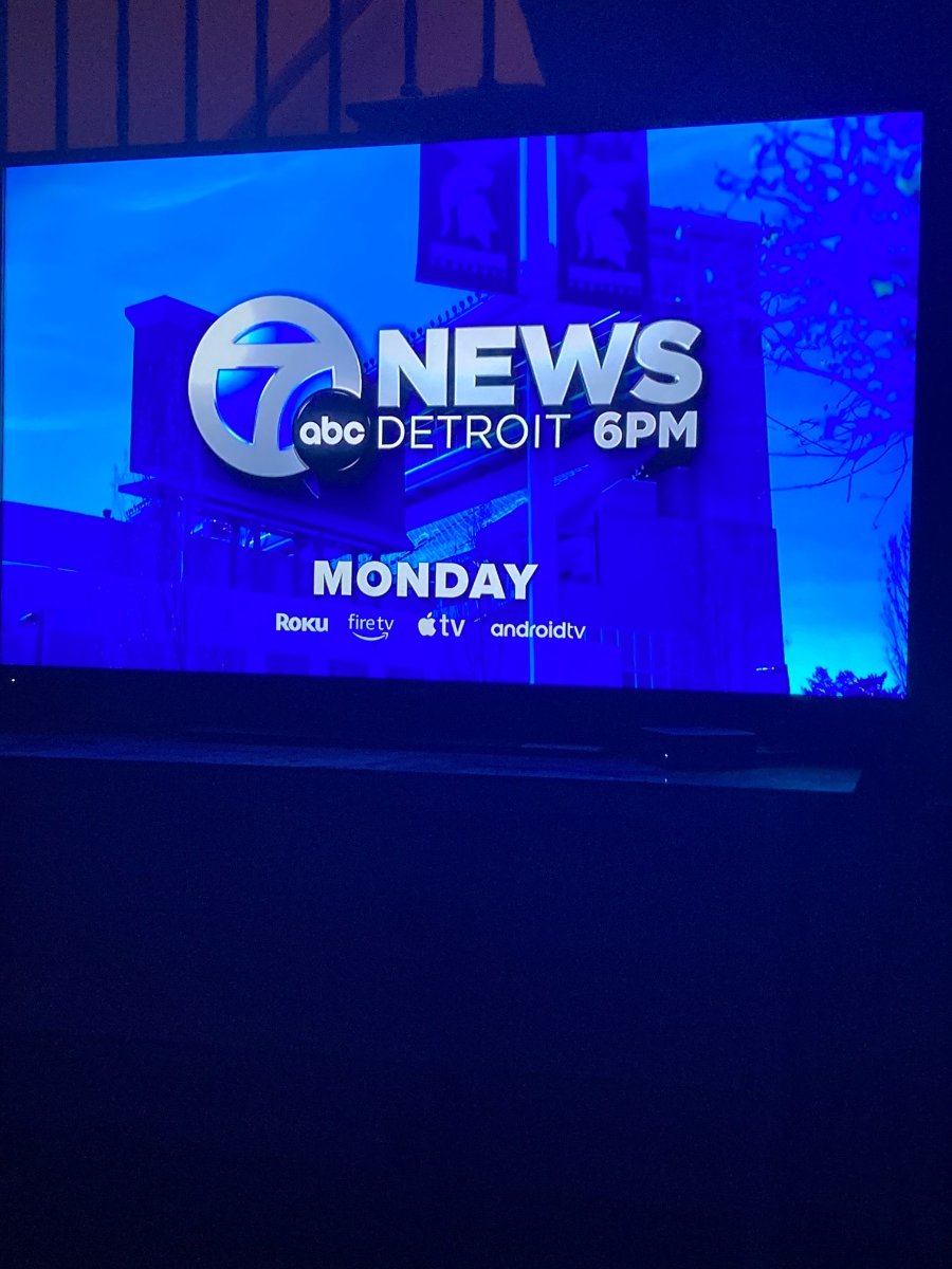
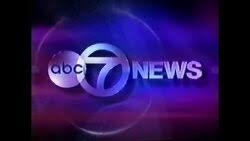
WXYZ Will be rebranding from 7 Action News to 7 News Detroit starting Monday morning at 430am. The morning show will be “7 News Detroit This Morning” which doesn’t have much ring to it. This is the first time they’ve rebranded their newscasts since 1972. They even have a nifty new logo that vaguely looks like it means hard news:

-
The fancy arrows DO have a purpose… they “move” the little line below the headline in the previews… you know… like you do in an app! Kinda like tabs that look like text boxes… it’s what all the kids are into right? I swear these ideas are from somebody about to retire who is about as hip as a heart attack.
-
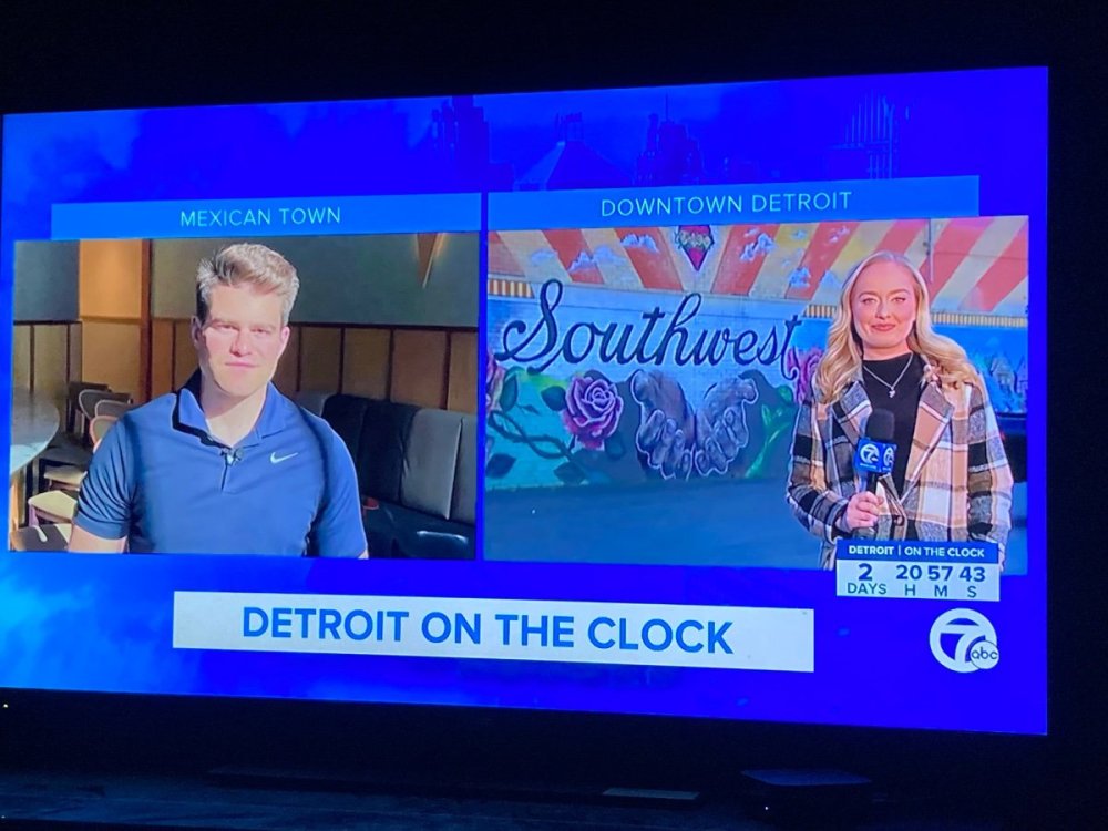
I managed to fire up the online newscast on my Apple TV so I can see what this looks like on a TV vs. my phone… the lower thirds owe royalties to somebody in Fargo, ND. There is no separation to the names of someone being interviewed and where they are from. A thin line between top and bottom would be awfully nice. The transitions where the graphic swings in and swings out again (weather for example) looks familiar… like 2012 familiar. Making your audience dizzy trying to read your graphic still isn’t in style. The best part of the package is probably the weather graphics. I never thought I would have a use for this but… *Cough* Why do TV news people have to have the same hard headed product philosophies as car executives? Keep it simple and don’t try to overflash or make it harder to read a graphic or see an image in an open. A large chunk of the viewers are older and may be turned off by it.
-
I think I prefer something simpler. I’d rather have the Scripps package than this. There are too many elements moving all over the place, the mashup music is jarring and strange. The live bug is weird looking and reminds me of something CNN might use. For spending years making it the whole thing looks like a ridiculous rush job. Color me disappointed. WLS downgraded big time. I’ll second whoever said it looks like WABC’s package.
-
Have they caught 20 yet? I kinda have my doubts…
-
Asking for a friend… doesn’t anybody proofread anything or understand what the edit button does?