Viper550
-
Posts
1099 -
Joined
-
Last visited
-
Days Won
2
Content Type
Profiles
Forums
Articles
Everything posted by Viper550
-
KPIX got bumped up to the previous CBS graphics, after having used a custom look for god knows how long. The Jaguars have a new one that is all over the place (and "ARIZ" is a very irregular abbreviation)
-
Bally seems to have done a tweak to their scoreticker, removing the shaded area below it entirely.
-
general thread NBC Sports/NBCSN/Golf Channel/NBC RSNs Thread
Viper550 replied to WCAUTVNBC10's topic in Sport Center
The Open finally got their graphics updated to match Golf Channel's current package; looks nice, and definitely less gaudy than the blue and yellow they had before (although to be fair it was meant to evoke the actual in-person leaderboard) Although this generic font they use alongside the Open's own serif font kinda cheapens it a bit -
Premier Lacrosse League makes its ESPN debut today. They are special enough to get a partial reskin of the college basketball scoreboard rather than the more generic scoreboard the NLL college lacrosse (and previously, college basketball) used, though it looks like it's meant to go with the rest of the "white rectangles" package) (though NLL games on ESPN+ use a slight variant of TSN's hockey graphics, probably because they're falling back on TSN as a bespoke broadcaster for games taking place in Canada, since they actually have more NLL broadcasting experience than ESPN itself)
-
Sportsnet has a new scoreboard, but it's basically just the same layout of their previous one updated to look more like the new flatter graphics they introduced at the start of NHL season. Honestly thought it was going to look more like the NHL one but this is serviceable too. The inserts haven't changed, likely because they foreshadowed this look to begin with. I also noticed Spectrum's got a flatter version of their graphics too.
-
Sportsnet sometimes saves graphics changes for the season opener. The rollout has been a bit of a mix: the MLB package has had flatter fullscreens/intros that would definitely not look out of place with the new graphics, but some sports (i.e. Raptors and curling) are using only the new L3s/scoreboard and keeping the rest of their packages. Curling is also using the old scoreboard
-
Though, by contrast, NBC's music doesn't sound as "dated" (it's the punchy 80's synthesizers that do it) While we're on the topic, Record's is also a lot more contemporary
-
Yeah, and Globo definitely has their own ways; that music is very 80's
-
NASCAR's getting a new look. It's stylistically closer to the NFL package (illustrations and all) but with more of a "comic book" look. Running order display is pretty much identical except for BOLD ITALIC FONTS EVERYWHERE https://www.autoweek.com/racing/nascar/a38884019/fox-sports-turning-nascar-driver-superheroes/
-
Sportsnet is back in social distancing mode on-set with split-screens, most likely due to Ontario public health orders and Canadian travel restrictions (which are much stricter than what exist in the U.S., which can have a full studio panel without weird split-screens and Brad Marchand drop an S-bomb on basic cable. Also noticed Sportsnet is using a generic replay wipe for the Boston/Montreal game, implicating they may be sharing video with TNT
-
Rede Globo, a Brazilian powerhouse that had a habit of clinging to old design trends for decades past their sell-by date (although they got a bit better at embracing modern design trends in the mid-2010's), recently unveiled a major revamp to their brand identity. They had been rebranding and reorganizing a lot of their divisions, and had been slowly rebranding as TVGlobo since late-2020, but now it's official. It has a very neumorphic look that has unsurprisingly drawn many comparisons to the equally-massive BBC rebrand.
-
Sportsnet debuted the NBA version of their new graphics and surprise surprise, it's just the NHL one but in the bottom-right instead.
-
The BBC has undergone a major rebranding, with a tweaked corporate logo and new on-air presentation elements. It is a phased rollout, though; only BBC Four officially got new idents (still carrying on the quadrants theme they've had for a while now), with all the other channels mainly being limited to new promos/etc. As pointed out, the very first program to air wound up (Breakfast) still having an intro with the old logo on it.
-
Did the Sinclair ransomware attack mess up Bally Sports Ohio's spellcheck?
-
NESN is business as usual, but did add shots on goal to their scoreboard.
-
In this, that came up shortly after the normal goal animation on the scoreboard
-
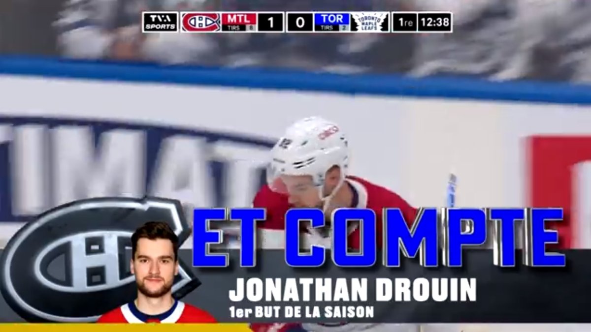
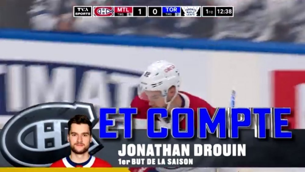
And Sportsnet's new graphics are official The old Sportsnet graphics were dated out of the gate, especially when that was when all the U.S. networks were starting to go flat. These are a major improvement, though the team section is bugging me a little bit (the width, lack of team logos, and not doing the soccer-style layout anymore) Meanwhile in Montreal, TVA Sports is still using the old Sportsnet graphics, but they appear to have retextured them to be flat. I'm not sure if I like this.
-
And yep, that ended up being the scoreboard. The lack of shots on goal is a little disappointing (could have easily took pages from some of ESPN's other events and had the wordmark to the top with Opening Night, and remove that NHL logo to make room for it), but it's a good first impression. Seeing the Monday Night Football-style AR graphics for the starting goalies was also a good sign, but I'm sure some fans are dreading whether a certain other MNF graphic will end up rearing its ugly head (those stupid CGI cartoon things) Something I also noticed was that I guess the NHL is no longer insisting that the Golden Knights be abbreviated as "VGK" on all scoreboards; ESPN was using "VGS" tonight. In addition, Sportsnet has debuted its new graphics; they're out in full force on their studio shows, but tomorrow we'll see them in-game for the first time. They remind me a lot of Fox's, except a LOT more white and blue, and with only one rounded edge. The ticker reminds me a bit of ESPN's, but they successfully resisted the "put a giant banner ad in the bottom-corner" trend at least. The Kraken playing preseason games against Canadian opponents makes this most likely one of the shortest-lived graphics in all of sports...
-
Sportsnet is doing its own pre-game for the opening doubleheader: the new studio looks like a downgrade from what they had before (unfortunately I think TNT appears to have upstaged them), and I am hoping the theme music they used isn't the main theme because it didn't exactly feel like "hockey" music? (either that or they're saving the normal music - if they're still using it -- for their official opening night tomorrow). But finally Sportsnet has some new graphics; finally gone flat, and they look absolutely nothing like what they had before.
-
We have another new hockey rightsholder here in Canada, with CBC having picked up some major junior games as part of a new CHL package (which sees TSN take over the main package Sportsnet used to have). This is also the first time we've had a CBC-produced hockey broadcast outside of the Olympics in a while: all of the graphics are the "standard" red/gold ones they use elsewhere (most of the L3s/etc. are a flatter evolution of the old HNIC graphics), and this scoreboard is very TSN-like
-
The Point looks pretty shiny; there's a chance that this light/icy look could be the graphics we see during games, but who knows that will happen?
-
The TNT graphics look pretty robust. Looks like a mix of Fox and Altitude. Only thing bothering me is how wide the box for the scores are, but I don't know yet if they're going to show shots on goal in it too.
-
It's almost time; there has been a lot of NHL-related news in the media realm, given the new U.S. rightsholders, as well as Sportsnet getting a new studio and hopefully new graphics this year (if the renderings of their new studio are any indication). ESPN's logo was recently revealed, and it reminds me a lot of the previous NBA on ESPN logo so that's a good sign. Long-time HNIC voice Jim Hughson also announced his retirement today at the age of 64; although it was stated to be COVID-related, I wouldn't be surprised if him only doing Vancouver games last season was meant to lead into this.
-
Stadium is now using the Bally graphics for its college sports broadcasts, using the "fixed" version also used for the Lions preseason games. Though in my opinion I probably would have had them made darker to match the rest of Stadium's branding. Though at one point it looked like someone at network control didn't get the memo, and put a Stadium ticker over the Bally ticker that is also a scoreboard).
-
So it seems like they're patching the scoreboard to have the lower area be transparent. A little better