


ABC 7 Denver
-
Posts
2676 -
Joined
-
Last visited
-
Days Won
48
Content Type
Profiles
Forums
Articles
Posts posted by ABC 7 Denver
-
-
On 6/15/2023 at 12:37 PM, 13 Eyewitness News said:
Do they have an previous experience making news graphics packages, because it really doesn't look like it. They tweaked the GMA look by basically taking the logo by putting it on a yellow circle. But didn't change much else, like the lower-thirds are nearly identical to before, which I like.
I don't really think anyone can call this a "rebrand":


Vivid Zero is managed by the Principals of Stun Creative.
-
 1
1
-
-
33 minutes ago, C Block said:
Sorry, but I'm not a fan. This doesn't feel like much of a substantial improvement. It very much has a "designed by committee" vibe to it. The opens are too busy, and the 3D elements already look just slightly out of date. The supers and fullscreens are fine, but nothing amazing.
I think the KABC/KGO look is still the best of the bunch by far.
It was designed by
Smith GeigerVivid Zero who designed the rest of the ABC look.-
 2
2
-
-
2 hours ago, 24994J said:
I REALLY like their take on the ticker.
No dots?
-
1
-
-
2 minutes ago, nycnewsjunkie said:
Suffice it to say, there have been better executions of the new package. However, as bad as this is, I can’t say I totally mind the sloppy and out of place usage of Enforcer, especially given how repetitive that one cut of Dimensional can get after a while. I really don’t understand why stations don’t use different cuts of Dimensional to at least have a little bit of musical versatility.
That said, WBBM had a lot of time to roll this out properly, and they fumbled imo.
You do know that dimensional is a very small package, right?
-
2
-
1
-
-
22 minutes ago, WCAUTVNBC10 said:
To add to the mess, I'm pretty sure that's an Enforcer cut being used as the bed for the headlines.
I'm 100% certain. Dimensional isn't a robust package.
-
1
-
 1
1
-
-
I'm going to put this forward now. With Nexstar clearly having no morals, indicated decisively with them airing the LIV golf tour I'm about 95% certain that Tucker Carlson will get a show on NewsNation.
-
3
-
1
-
-
21 minutes ago, ttvn2000 said:
This. 100% this needs to be the model for all stations using a number. Using the eye in the box and in the “CBS News <City>” naming is redundant.
Most stations won't use this, though.
-
1 hour ago, JTT said:
What's covering the eye 2?
A piece of metal.
-
 2
2
-
-
7 hours ago, MorningNews said:
Obviously there are reasons for it but seems amateurish to move into a space that’s not ready for primetime yet. The shots this morning were so awkward.
Are you new to local news management in 2022? Amateurish is the standard quo now.
-
2
-
-
57 minutes ago, tyrannical bastard said:
I'll bet you 50 bucks the next sports push Nexstar makes for the CW is gambling-related!
DraftKings on The CW.
-
10 hours ago, Myron Falwell said:
The FCC is asking for an ALJ to weigh in on the deal. Lance Venta has the details.
It’s utterly dead now despite all of Soo’s huffing and puffing.
Thank F*CKING god. I'm sorry, but this deal was absolute sh*t for the viewer and for the journalists. Hopefully TEGNA can resume operations and hiring.
-
2
-
-
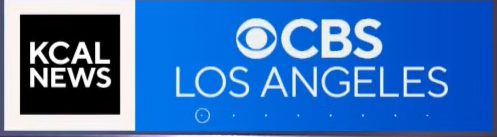
18 hours ago, Myron Falwell said:
Because, as @Weetersexplained, the “KCAL” box is the only box meant to be a brand that could kinda-sorta last in the long term. So that streaming bug accommodates both brands and will do so OTA very soon. The “CBS 11” box is blatantly temporary and once it’s dumped, they’ll adjust the proportions.
THE. CBS. 11. BOX. IS. GOING. AWAY. VERY. SOON. CHANNEL. NUMBERS. ARE. BEING. PHASED. OUT.
That's not an excuse for the size of the logo. WAS. MY. POINT.
-
21 hours ago, Myron Falwell said:
It’s literally the same dimensions for every other station using the package. If “Texas” was smaller in size y’all would be grousing over that.
And yet this somehow looks much better.
-
2 hours ago, Myron Falwell said:
Well, if you get rid of the obviously tacked-on-at-last-minute "CBS 11" transitional box, the "CBS News Texas" box aligns perfectly.

Sure, if you want a ton of dead space.
-
2
-
 1
1
-
-
1 hour ago, NewEgg00 said:
Another note too. "CBS News Texas Sports"???
Long name for a local sports division. When CBS was developing this entire local strategy as part of the national rebrand, didn't they thought of a division combining CBS Sports and the locals that cover it? Or....just simply asking stations to brand sports coverage based on it?
SB: Nice to see Andy Adler from her (W)PIX 11 days.
CBS didn't develop this strategy. One of their local stations did.
Could that bug look any more disproportional?

-
2
-
1
-
-
46 minutes ago, NewEgg00 said:
Obviously, with TV stations. But online digital coverage, why not?
When have you seen a TV group invest in that at all in a thorough and effective way?
-
33 minutes ago, Myron Falwell said:
Not unless you have plans to expand your presence... and there's a bunch of CBS affiliates owned by one company that doesn't want to exist in places like Houston, San Antonio and Tyler.
CBS isn't looking to expand in Texas or Colorado.
-
1
-
-
1 hour ago, Georgie56 said:
According to Zap2It, KTVT is rebranding their newscasts to “CBS News Texas”.
KCNC in Denver is going a similar route, branding itself as CBS News Colorado. Though I'm surprised considering they don't do a great job covering Southern Colorado, the Western Slope or Northern Colorado.
Calling KTVT CBS News Texas makes even less sense. CBS doesn't have enough resources to cover all of Texas. Should have stuck with CBS News DFW.
-
1
-
-
1 hour ago, NewEgg00 said:
That's why we have Public Media. We have PBS NewsHour. Yes, it's an hour. But their stories have so much room and relaxes. Even their weekend edition (30mins) still holds the concept.
Theoretically, but it's gotten so much into analysis and commentary. It's not news! It's Public Media on Cable in that case.
6 hours ago, alaskanews said:Looks like CBS just got consultant-bombed. This new opening sequence is an absolute disaster. If this is supposed to hook viewers it did the opposite to me. I wanted to turn away
WHAT AM I SUPPOSED TO PAY ATTENTION TO?! What am I looking at? What am I supposed to hear? The awful vamp? The voice over? Those graphics are too distracting. Is this a newscast or a sizzle real for a ad agency?
-
1
-
2
-
1
-
-
5 hours ago, MD TV said:
There's a nice article here from a few months ago about Hulu and the dilemma it faces within Disney:
A big problem is that next January Comcast can force Disney to buy out their stake in Hulu, and that's gonna be well in the billions.Comcast, unsurprisingly, hasn't been all that interested in creating a directed streamer. Peacock is FAST, but it lacks the investment that Paramount+ and Disney+ has had.
-
8 hours ago, Myron Falwell said:
Notice they had something different underneath the path in '85

Station priorities at the time were not to change their slogans often. We're in different days. We don't lock in slogans to the logo because the slogans will change more quickly than the logo does.
-
3
-
1
-
-
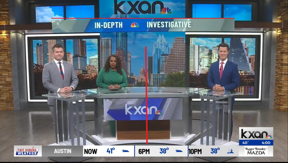
5 hours ago, alaskanews said:
There are a lot of textures happening on this set in general, but this wide shot.. my eyes don't know where to look. I think the plexiglass panels on the desk flanks (which create six vertical lines on either side) are what tips this into too-busy territory.
Also seems like they need to re-level their camera. Horizontal lines at the top make it very apparent that the shot is lopsided.
To your point, those plexiglass panels on either side of the desk are the debate podiums they used earlier.

Also these red lines support the camera leaning to the Left:
-
2
-
-
7 minutes ago, Georgie56 said:
First from the Discord: Scott Jones reports on his Patreon that CBS News & Stations is dropping The CW from its duopoly stations in protest of the LIV Golf deal.
(h/t @24994J)
Hahahahahahaha! Dumbasses.
-
4 hours ago, CLETVFan said:
Scripps is once again growing in cable. Makes me wish they didn't sell DIY, HGTV and Food Network in the first place.
Odds are that they eventually spin this division off again.


Fox Television Stations - General Thread
in Corporate Chat
Posted
CMG to keep it with WFXT.