

-
Posts
35 -
Joined
-
Last visited
ecs0013's Achievements
Assignment Editor (1/8)
9
Reputation
-
I think it's tough because at some point, one stops giving a crap about the how/why. Sinclair has basically made it so no streaming service can carry them, so I can't really blame Hulu for that. In my case, I lost Marquee and FS Indiana, meaning no Cubs and no Pacers. I thought Marquee was kind of stupid to begin with and it was okay this season (grading on a curve for a new RSN), but over the last few days, I've wondered what my decision will be when games start back up if they aren't carried anywhere other than cable/satellite (not going back to AT&T TV Now). I wonder how things like this can erode a fanbase, too. While the Cubs aren't going to lose a lot, the move away from WGN (the national feed, too) has made it feel less nationwide. Marquee not being carried on the same places as NBC Sports Chicago and getting used to some new personalities also feels weird. Now that you've pulled it completely, I may be more inclined to check out the White Sox (who I can still get) or even out-of-market teams on MLB.TV. The NBA is similar in that the Pacers are usually fairly good, but I feel like I watched way more of the teams that went further in the playoffs and can appreciate exciting players in other markets.
-
I saw it in passing on a few promos. I'm really conflicted, as I HATED the "rtv6" branding (both from when I came to the market until 2007ish and then when it came back with the Scripps purchase). It's stupid (the call letters go back to "We aRe TV," so dropping the W kind of makes it not work), clunky, and just fits when the station was an also-ran. I really liked the faux-WLS feel that was in 2007-2012 with Gari's Eyewitness News as the theme, the circle-6 logo, and "6News" as the branding. It was different enough, but felt way better than some of the prior packages. I was also sad to see Scripps drop the 6 logo that had been around in some variant for years. On the other hand, did they even pick a typeface for this or just go with the default Scripps one these days? It's also 6 on most cable systems, so that could've been kept (unlike some obscure UHF station that brands itself for a low cable slot). Funny enough, down the street, the "WTHR" text portion of WTHR's "logo" (aka not the 13) that Tegna kept is the typeface from their old graphics package (when they redid their logo to be sans serif), so it sort of feels both unique and out of place at the same time.
-
 I'm a little bummed about WTHR getting Tegnafied (on top of everything else), so it's really nice to see WNEP being the little corner of the Tegna empire that is still kinda doing its own thing. I saw WNEP's stuff a few times when visiting family years ago, but I also completely forgot about Talkback 16 (I remember seeing clips on Last Week Tonight a few years ago)—the criticism and praise of the graphics from random people was just....perfect. Also, I just realized with WNEP being owned by Tribune previously, they were using the graphics that I think started at WTTV...it looks like they left the swirling CBS logo background in a few places hoping people wouldn't notice?!
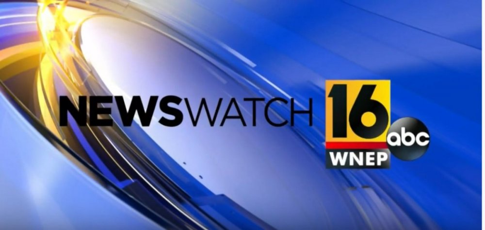
-
TEGNA Broadcasting and Digital General Discussion
ecs0013 replied to ABC 7 Denver's topic in Corporate Chat
When WTHR and WBNS were sold, we all knew it was a matter of when, not if, and the graphics aren't terrible (WTHR's prior graphics were better, but those who don't follow this stuff could almost think these new ones as an evolution of those). Losing the Eyewitness News branding and the Tower disappointed me. I dislike that they kept the Live Doppler 13 branding for their weather because weather is more than just the radar (that happened at some point during the most recent graphics package—SkyTrak Weather became Live Doppler 13 Weather). I'll be curious to see what staffing changes happen now that Tegna's really starting to handle operations and how the market will respond. Despite all the weird drama over the past five years (ownership and affiliation swaps), Indy has become a cookie-cutter market for the big station groups: WXIN/WTTV are going to use whatever graphics Nexstar rolls out to most stations (maybe unique music though?) WRTV is cookie-cutter Scripps WTHR is cookie-cutter Tegna WISH is going to be the wildcard though...stuck with Nexstar graphics at the moment (I dislike the rotating box logo they recently threw in), but might be interesting since it's the independently-owned station in the market...perhaps they'll carve out a niche?)- 3592 replies
-
- 1
-

-
- innovation
- tegna
- (and 1 more)
