b.png.4a4f72b902e4210e6802e3e35b176cae.png)
Geoffrey
-
Posts
1125 -
Joined
-
Last visited
-
Days Won
35
Content Type
Profiles
Forums
Articles
Everything posted by Geoffrey
-
It was not very good. Not sure what happened to it, and if this is the same space. (It appears to be using some of the same elements.)
-
This perfectly sums up Licht at CNN: He should have listened to Colbert and kept the great job he had at The Late Show.
-
AC360 recently started opening the show teasing some of the stories coming up in the broadcast. (It used to start by going right into the top story.) Notably, they are using music (I think the old AC360 theme?), which I don't believe this show has used in many, many years.

-
If not for The Atlantic piece, I wonder if Licht still would have been fired or have been allowed to continue flailing. There were clear problems but that piece really exposed it to the general public. Zaslav is still in charge so will anything really change? He still wants to "appeal to Republicans" (a.k.a. bothsides reality).
-
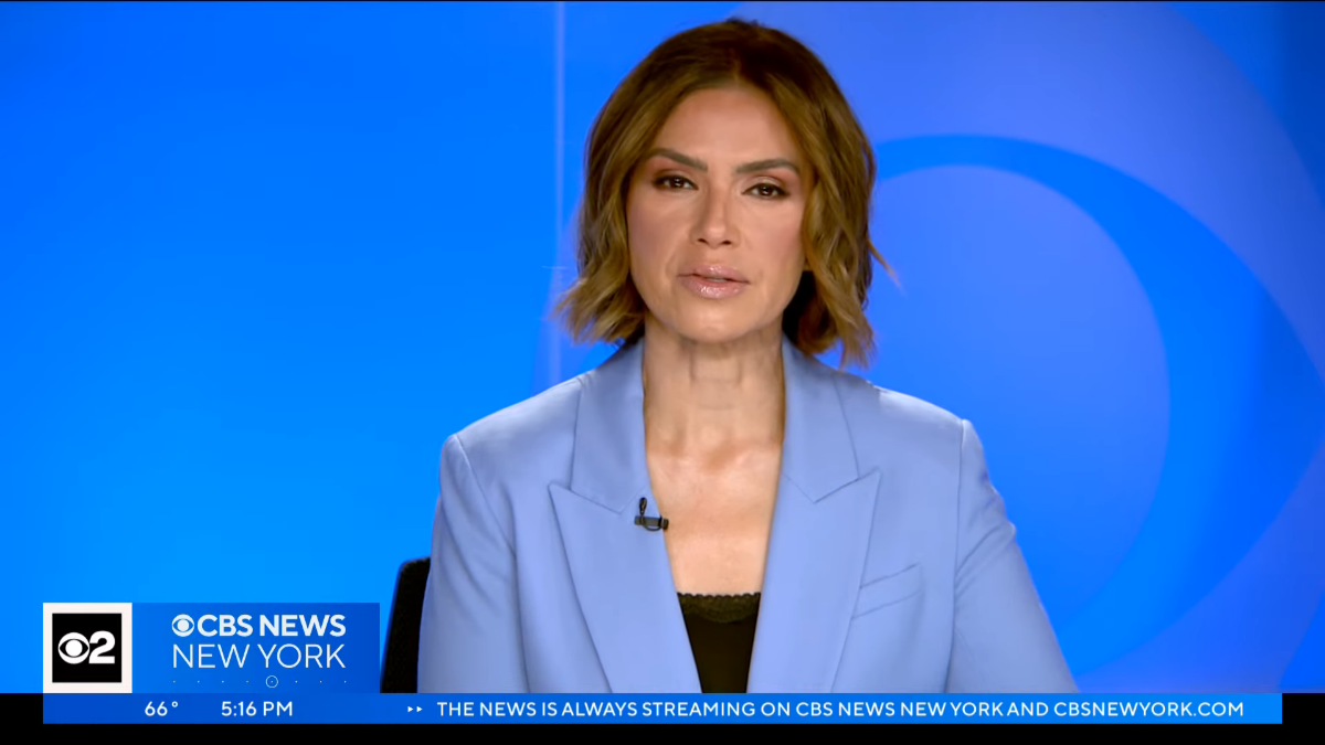
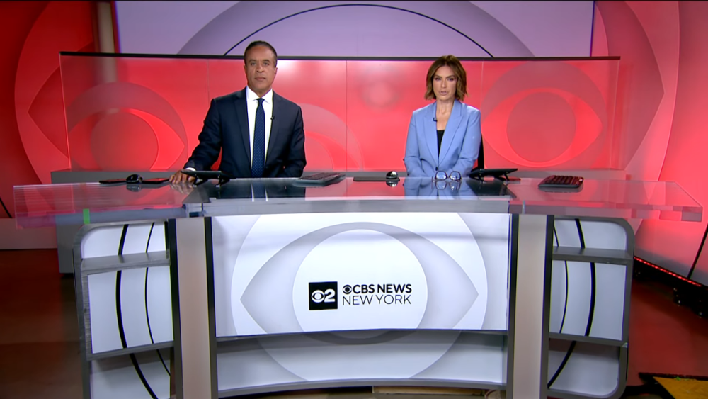
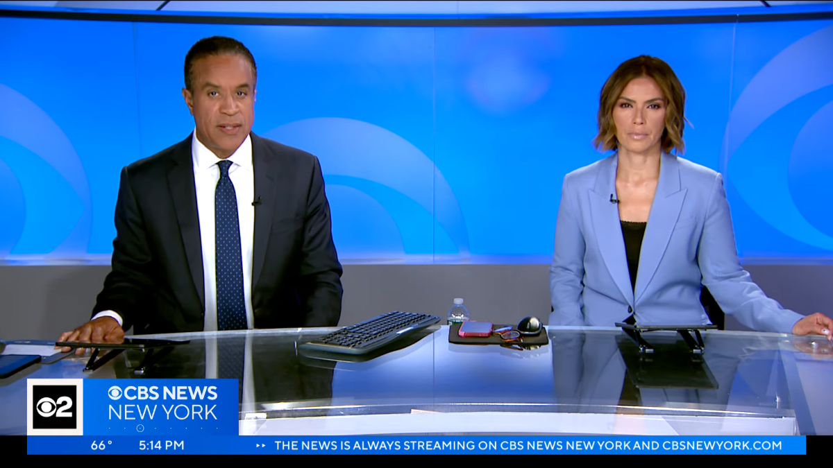
Edit: Sorry, didn't realize there was already a thread in the Studio section... Looks like CBS 2 CBS News New York is on a temporary set.

.thumb.png.ab7bbf98eee786639d4336d8aab5d0e8.png)

-
That is terrible.
-
b.thumb.png.b658c90e4e56cb08f2e8ba3195bb9da9.png) Being a Sunday political show moderator is usually a pretty big job and requires a lot of prep work, and sometimes traveling to get certain interviews. Being tied down to the anchor desk on a Saturday could get in the way. Plus, they would probably want to keep her available on most weekdays to serve as an analyst.
Being a Sunday political show moderator is usually a pretty big job and requires a lot of prep work, and sometimes traveling to get certain interviews. Being tied down to the anchor desk on a Saturday could get in the way. Plus, they would probably want to keep her available on most weekdays to serve as an analyst. -
If the Post is to be believed, CBS may be looking to sell the Broadcast Center and find a new location to buy or lease. https://nypost.com/2023/06/04/cbs-mulls-sale-of-its-west-57th-st-broadcast-center/
-
Here's the promo box without the rest of the lower-third. Regarding the Licht article, Brian Stelter has been following the blowback in several threads, including this:
-
A few more snaps... I believe last night at 11 was the first time the words "Breaking News" were used on CNN with the new look, and there was nothing special about the graphics. Perhaps the different look will be used for more urgent/less expected breaking stories. (The Breaking News open remains unchanged.) When CNN International's CNN Newsroom airs overnight, there is no flipper in the U.S., so it's just the ET/PT time box. I was wondering where their "promo box" would go and I... was not expecting this.

-
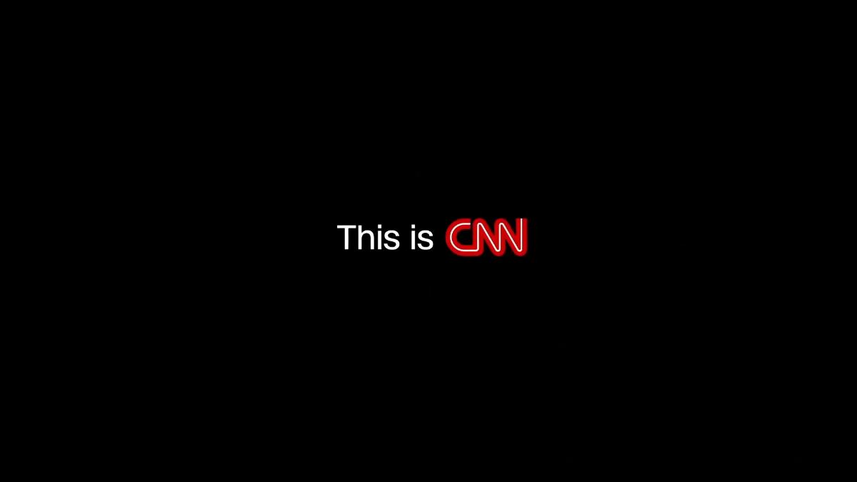
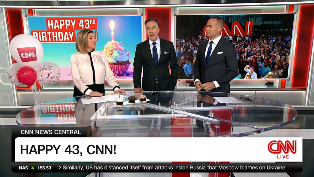
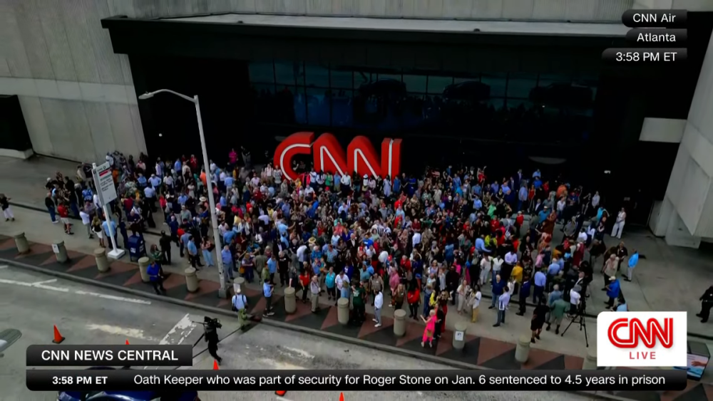
A few more extra nerdy observations... They seem to rarely use it but they still have the two-sentence lower-third. I wish they would use it more, otherwise it feels like there is a lot of wasted white space. The space looks extra wasted when the all-caps headline is long. In the old look, the text would stay the same height but squish to fit on the box, sometimes looking pretty ridiculous. Now the text is resized. (Also, the upper graphics look especially bad, in my opinion, when all three "bubbles" are there.) The the flipper first starts up, a CNN logo appears under the main CNN bug, then quickly moves left before being replaced by the time/stocks. The flipper is also fully rounded on both sides. The time seems to be an overlay instead of part of the flipper. The CNN logo slides lower in the bug when the "Live" is not present. This is how the HLN simulcast looked (including no flipper, at least for the few seconds I checked -- not sure if this was how they did it before today): Just like the previous look, the stock ticker includes an up/down arrow in addition to a +/- icon. It's redundant (and you could actually argue that it is inaccurate when the index is down -- it's like a double negative). They have new promo/IDs showcasing the "CNN Archive." Nothing fancy, no special animations , no music, no voiceover. Just a few seconds of raw video of a CNN correspondent at some event, with a "This is CNN" graphic at the end. Reminds me somewhat of the "This Is Who We Are" moments on MSNBC, except those are often recent lighthearted moments from live TV, often involving studio clips. CNN's all seem to be much more serious. In one, I saw Nic Robertson talking to his photographer while waiting to go live in Russia in February 2022 telling her not to get arrested if he does. I think I noticed another one as far back as 2012 or 2013. (The 5-second IDs with various correspondents saying "I'm [name] in [location], and this is CNN" have not gone away.) Also, today is CNN's 43rd birthday. They marked the anniversary and CNN's moving out of CNN Center right before 4 p.m. (Today's new graphics on top of the very first CNN newscast.) Thank you for indulging me.


-
My first reaction when we saw the off-angle screenshot the other week was to not like them. I need to see them a little longer to get a feel. But overall these feel like fan-made mock-ups to me with some corners rounded. The show name being moved above the main lower-third covers up more screen space. The "Live" looks misplaced being so small under the CNN logo, and it does this weird fade/slow flash every few seconds. I actually liked the old one-line name/title bar that meant the headline stayed on the screen, and that's been replaced by the more traditional two-line version as @PTVNewspointed out. Pretty much the only thing I do like is the use of a flipper instead of the endless ticker. Only name/title and the flipper used mixed-case letters... everything else is all caps. I remember the original story about the new graphics a few weeks back said there would be a different style for breaking news. I'm interested to see if this means more than just more red or some small difference like that.
-
Eight CBS Stations to Ditch CW and Go Independent This Fall
Geoffrey replied to AKA's topic in General TV
While the call-letters-in-a-box logo could very well be the new look, it's also possible that this is just a placeholder and gives them a few months to come up with something else. -
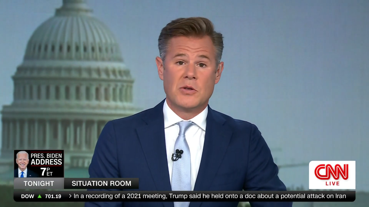
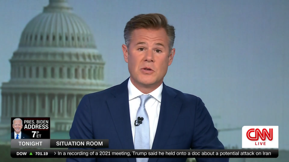
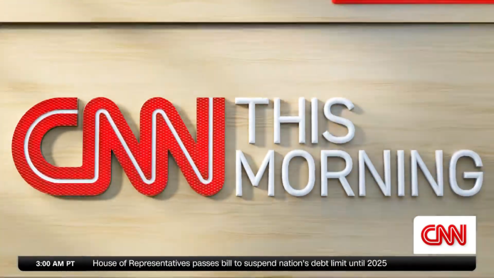
Kaitlan Collins signed off from CNN This Morning this morning.
-
Do we know if they are using the CBS 13 logo in the bug on TV? (It looks like the CBS News Sacramento bug may be inserted online.) Interesting that the logo seems to differentiate that CBS News Sacramento is very specifically only the online service, whereas the other O&Os have it as part of the newscast name, whether the announcer calls it that or not.
-
Where do we see NewsNation one year from now? Bigger or smaller than today?
-
BREAKING: Tucker Carlson Out At Fox News Channel
Geoffrey replied to Georgie56's topic in US Cable News
Putting this here because it's probably related... MAGA-on-MAGA violence going on over there. -
Glad that CBS is reading us as they continue to fix their mistakes we point out.
-
CBS Sunday Morning - Will it Ever Go Back to Live?
Geoffrey replied to Jascarter's topic in Network News
I'm glad "CBS News" is part of the logo again. Didn't understand why they took it out. -
A mouthful of a name but interesting to see. Figueroa was a good guy when he was on the Mets and worked for SNY for a time but left due to some personal struggles. Glad to see he's landed back on his feet.
-
I think this thread is losing focus and becoming a list. In the end, an employee was let go for using a slur about a coworker at work (presumably) to another coworker. We can do better than trying to figure out whether the woman deserved to be slurred by her coworker at work.
-
WCBS also uses this for some bumpers. Why ditch a new package designed to connect the station to the network with cheap somber church bell production music?
-
You're blaming someone for getting a promotion?
-
Oh, no. The only thing I like is that the ticker appears to be a flipper. Interesting that they chose to highlight their weekend morning anchors here (or at least that's all we see in this image -- perhaps it was part of a larger presentation).
-
CBS 2 CBS News New York recently started using different music for many opens and bumpers. I haven't figured out a pattern but they sometimes use it and sometimes use the regular theme. The music does not have the CBS signature and can only be described as "somber church bell." I don't understand what's happening over there.


.png.bf14870226cc9af9fdcf9a53c9148518.png)