mightynine
-
Posts
300 -
Joined
-
Last visited
-
Days Won
13
Content Type
Profiles
Forums
Articles
Everything posted by mightynine
-
"NewsNation: Where One Of These Retreads Will Get Us Eyeballs, Right?"
-
Did they forget to load TT Norms in? That looks horrible.
-
I think these look pretty good, actually. I like the different colors highlighting certain stories, a nice addition if you're just glancing at the screen and decide you want to focus more on a campaign or money story.
-

ABC changing their logo; New graphics coming for ABC owned stations
mightynine replied to Briella's topic in Graphics
My guess is, since it's labeled as KTLA 5 News on iHeart, it's just an audio simulcast of this, which is mainly newscasts and news replays :https://ktla.com/on-air/live-streaming/ -
What part of "offer no specifics" makes you think I'm buying the spin at face value? I was just sharing what came up in a Google search. Personally, I doubt NN is turning a "good" profit. As for your other statement, I doubt you'll ever be in any position to make decisions on staffing anywhere.
-
Nexstar execs claim it's profitable, but offer no specifics. I don't see anything in their last quarterly report. From last year: https://www.hollywoodreporter.com/tv/tv-news/newsnation-expands-new-york-chris-cuomo-elizabeth-vargas-1235401963/ https://www.axios.com/2023/04/18/newsnation-multimillion-expansion-dc-nyc
-
The Ever-Evolving Gray Graphics Situation...Thread
mightynine replied to NEOMatrix's topic in Graphics
Cool! -
The Ever-Evolving Gray Graphics Situation...Thread
mightynine replied to NEOMatrix's topic in Graphics
I don't think the sting and the graphic line up well. Something with a little more urgency/tempo would work better (IMO), especially coming out of the open which has a little more energy to the music. -
The Ever-Evolving Gray Graphics Situation...Thread
mightynine replied to NEOMatrix's topic in Graphics
I’m surprised at how well Hello News works with a modern graphics package. It’s a little clunky with the First Alert Weather sting, but the open fit well. -
The Ever-Evolving Gray Graphics Situation...Thread
mightynine replied to NEOMatrix's topic in Graphics
That was fixed quickly during the broadcast, with the translucent background added. -
The Ever-Evolving Gray Graphics Situation...Thread
mightynine replied to NEOMatrix's topic in Graphics
EDIT 1/16/24: WAFB has moved to GrayONE as of Noon on 1/16/24. Put WAFB/Baton Rouge on the clock for GreyONE - this new logo just popped up on their website: Previous logo, in place for decades with the CBS eye logo added along the way:
-
The Ever-Evolving Gray Graphics Situation...Thread
mightynine replied to NEOMatrix's topic in Graphics
The alternate graphics in question are just a reskin of an already existing pre-GreyOne template, so maybe there's a technical issue unique to those stations (i.e., incompatible equipment with GreyOne) and this is a band-aid until Grey decides to pony up the cash to fix it. -
-
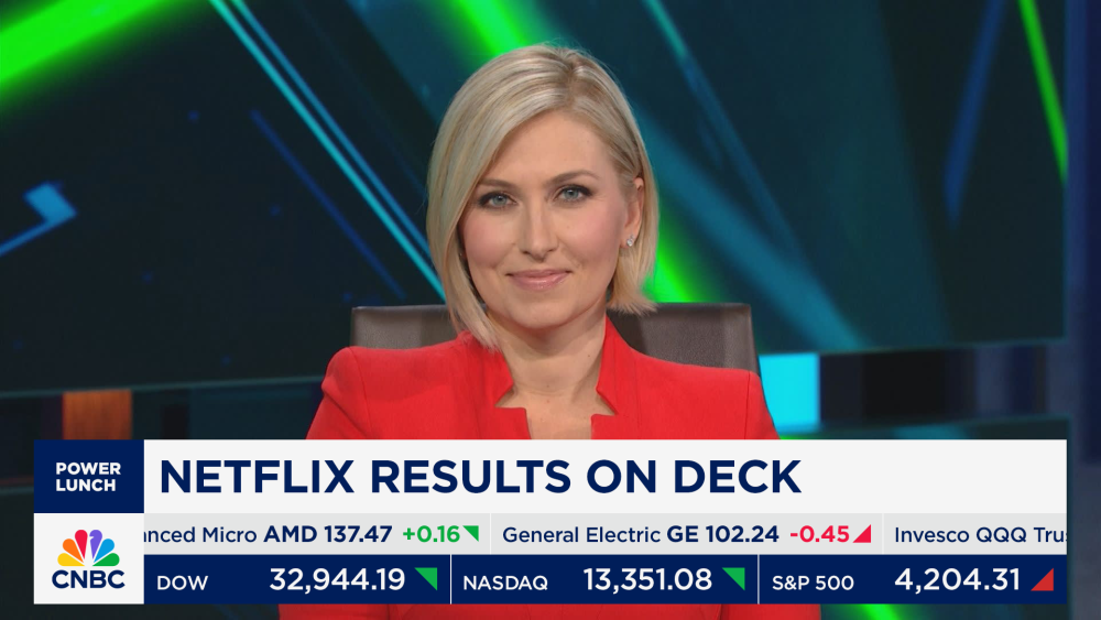
CNBC logo has been Tinkered, bringing along a refresh to the graphics as well. https://variety.com/2023/tv/news/cnbc-ticker-overhaul-screen-graphics-tv-news-1235832629/

-
The Ever-Evolving Gray Graphics Situation...Thread
mightynine replied to NEOMatrix's topic in Graphics
Easy, they change to “WVUE 8” or “News 8” or something along those lines. -
In the newscasts, no. The bug just cycles through the logo in my post and the WWLTV.com logo, even when the morning news moves to WUPL. (AFAIK, WUPL still has a 6:30pm newscast too.) Also, the morning traffic anchor confirmed WWL also received new theme music exclusive to them. There's definitely more jazzy horn elements. Here's this morning's open - they started with the wrong bug in the L3s but corrected quickly. https://www.wwltv.com/video/news/live_stream/wwl-louisiana-morning-news-at-430-am/289-c9822f51-4e97-441f-9f26-a4e4abe98d0f
-
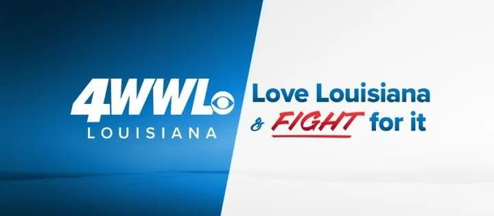
WWL-TV in New Orleans has dropped the long-standing “Eyewitness News” moniker for “WWL Louisiana”. So now it’s “WWL Louisiana News at XX”. Apparently a new tagline/positioner too? WWL-TV has in the past used “Louisiana’s News Leader” as a positioner, but “WWL Louisiana” just sounds weird to me. Any other Tegna stations trying something similar?
-
In a press release, Michael Corn, President of News at NewsNation, said, “NewsNation’s mission is to provide fair and unbiased news coverage, and that’s the way we will approach this important debate. We take this responsibility very seriously and are proud to help inform and educate voters and to contribute to the democratic process.” Dude gonna really sit there with a straight face and say “fair and unbiased coverage” with Megyn Kelly as a moderator.
-
Looks like the Retro Local on the 8s and Twilight Live are dead - schedule now has Heavy Rescue in those timeslots.
-
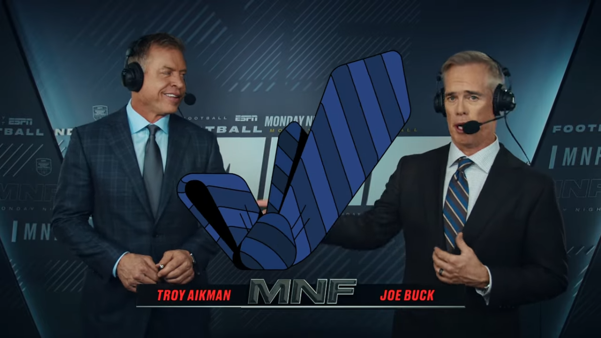
https://espnpressroom.com/us/press-releases/2023/09/itat-mnf/ Odd that a new "musical anthem" for MNF is starting in Week 2, but there was a nugget of info confirming the refreshed MNF look is just for Monday Night, since the other NFL shows have kept the neon green accents.
-
While at least so far the NFL shows on ESPN have kept the neon green accents, another hint that MNF might include more red comes from a new 30 spot for the NFL on ESPN. https://espnpressroom.com/us/press-releases/2023/09/espn-debuts-latest-creative-of-its-ready-for-football-platform/

-
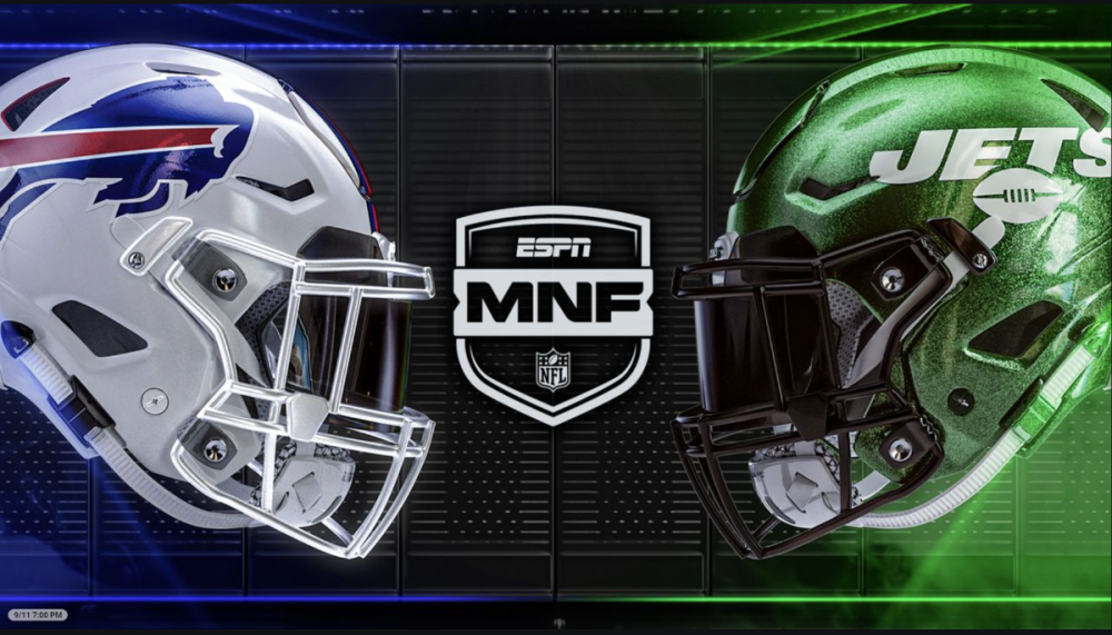
Could this holding image on the ESPN+ page for MNF Week 1 give a hint as well? MNF Shield shape is the same as the new one, not seeing neon green, more team colors....
-
ESPN hasn't made a big deal about any new graphics for MNF yet, but that logo does live on NFL.com's Monday Night Football Schedule page: https://www.nfl.com/schedules/monday-night-football/
-
Actually, that weloveweather site is dead now so that's why you don't see them mention it anymore.
-
I know the two are separate, but The Weather Company is no longer an IBM company - Big Blue sold it to a private equity group. https://www.cnbc.com/2023/08/22/ibm-sells-the-weather-channel-and-the-rest-of-its-weather-business.html https://www.hollywoodreporter.com/business/business-news/the-weather-company-sold-francisco-partners-1235571884/