WCAUTVNBC10
-
Posts
2472 -
Joined
-
Last visited
-
Days Won
8
WCAUTVNBC10's Achievements
Station Group CEO (8/8)
408
Reputation
-
Looks like they got a new set too
-
Looks like something maybe coming in the future for the NBC RSNs. They're now using the SNF style replay wipes and they're using a new overall logo design treatment (the peacock may even be of the new style just with the border by I'm not sure). https://x.com/nbcsphilly/status/1712610507419471946?s=46&t=SJjob8OrRnHreMIa-CVMsQ
-
ABC changing their logo; New graphics coming for ABC owned stations
WCAUTVNBC10 replied to Briella's topic in Graphics
Those aren't the default icons for that package. -
general thread NBC Sports/NBCSN/Golf Channel/NBC RSNs Thread
WCAUTVNBC10 replied to WCAUTVNBC10's topic in Sport Center
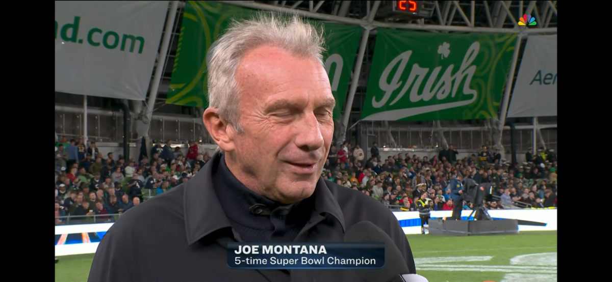
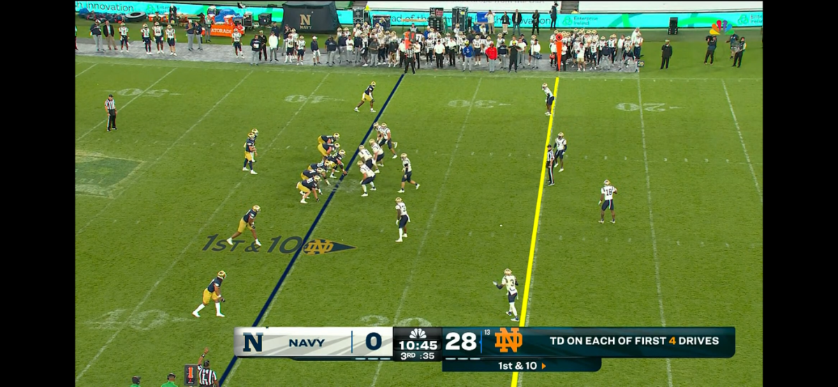
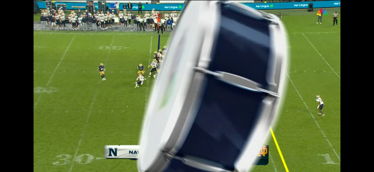
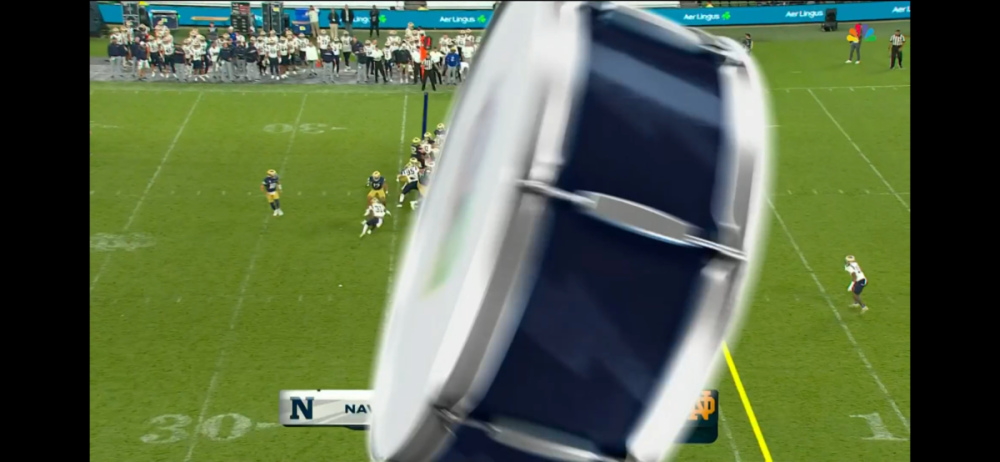
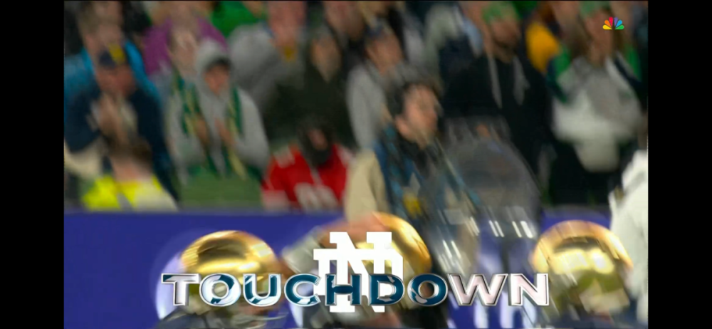
New graphics for NBC's Notre Dame (and I assume B1G) broadcasts. Looks like an evolution of the SNF look. Same font used.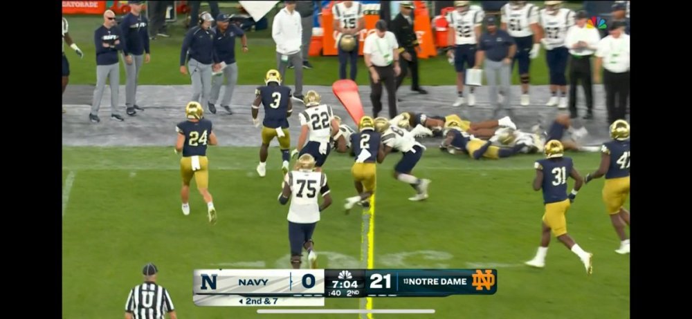


-
general thread NBC Sports/NBCSN/Golf Channel/NBC RSNs Thread
WCAUTVNBC10 replied to WCAUTVNBC10's topic in Sport Center
New set debuted for NBC's EPL coverage this weekend. Pretty sure that's the last of the original NBCSN studios to be replaced.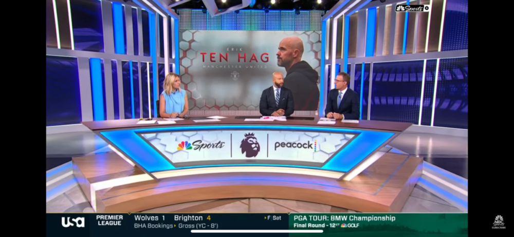
-
ABC changing their logo; New graphics coming for ABC owned stations
WCAUTVNBC10 replied to Briella's topic in Graphics
This. They were the one of the few of not only station group left without a centralized graphics hub. Part of the implementation of that is getting everyone on same page running the same graphics system. That way you don't need to build insert graphics for multiple systems. -
ABC changing their logo; New graphics coming for ABC owned stations
WCAUTVNBC10 replied to Briella's topic in Graphics
I like. Will be interesting to see this integrated into WPVI's style of opens. I can definitely see it though. -
I don't think this service is replacing the linear cable/satellite service, just running along side it. That makes more sense if the goal is to capture the cord cutters that ran away.
-
We're getting closer to a DTC service for ESPN: https://www.usatoday.com/story/sports/media/2023/05/18/espn-plans-to-launch-subscription-streaming-service/70233888007/
-
OTSes have to be built in the character generator where as a monitor graphic can be a simple video file that can be stored on the graphics server for continual use.
-
RIP Chroma Cues and the Westinghouse-ish 13.
-
I love it. It really shares a lot of elements from the outgoing CBS O&O Package which I know is from the same designer. The WLEX package was nice but as you said was pretty dated by this point. Looked like an old Giant Octopus package from the late-2000s.
-
To add to the mess, I'm pretty sure that's an Enforcer cut being used as the bed for the headlines.
-
Is that just an unchanged logo or do they use other characters from the typeface as well? I mean anyone with a basic knowledge of Adobe Illustrator can go in and do a image trace to extract lettering and shapes. The fact that only the call letters in the logo use the font tell me they don't actually have it.
-
I also think the Westinghouse font is lost media. It hasn't seen any regular use as a typeface since Westinghouse became CBS. There have been (bad) redrawings of previous logos (looking at you WJZ and KYW 1060) and KPIX never retiring their 5 til just this year but no actual evidence that it survives at all.