Leaderboard
Popular Content
Showing content with the highest reputation on 11/20/19 in all areas
-
Then enlighten the rest of the class. “Oh my god! It’s terrible, god help their souls” really doesn’t tell anybody a thing. So no I don’t know what you’ve seen and heard, you never said anything but some vague whining which I responded to by trying to politely tell you to chill. Now I can’t speak for a 2nd rate station like KMGH but it’s a basic fact that the third rate stations are going to do a far worse job applying the graphics than the 2nd rate ones and the 1st rate better than the 2nd. Or are you really gonna have everybody believe that they literally have 1 cut of music, 1 L3, 1 OTS, 1 Weather graphic, 1 open and 1 full screen graphic and that’s the whole thing? You usually come in here trashing whatever they come up with next... I want to see how a larger station actually applies them first and each will apply them differently by the way. Relax.4 points
-
You’ve heard 1 cut from the music package and seen graphics on a third rate station in a small market... Could you at least wait till WXYZ, WEWS, KSHB or the like adopt the look before declaring it to be so terrible? Even then I can think of much worse they could have done than these...4 points
-
These have been around for a few years (Here they are in March 2015) and are not related to the new Scripps graphics.3 points
-
To me this is like if Tegna and Hearst’s graphics had a baby. I’m don’t know what all the fuss is about. I like it for the most part. Once it launches in bigger markets I guarantee we’ll hear more cuts and see more elements. Gee whiz. You guys are hard to please.3 points
-
It's likely a fan opining. I've seen similar comments on various news montage videos.3 points
-
To be fair, has Scripps really replaced any of WTXL's equipment from when they were a Calkins station? Granted, they did have that short stint as a Raycom station, but I doubt Raycom replaced any of 27's graphics engines. Hence, why the animations are slow as molasses.2 points
-
At this rate graphics will be like cars... are they really all that different looking we’ll be asking soon... thanks for pointing out the differences, 6 years after I made that video my memory is a tad foggy... That is kinda odd... they must be close to ready to go with it...2 points
-
Finally...a bit of the WSBT version of the Making A Difference promo campaign. Been wondering about this for years. (1:08)2 points
-
2 points
-
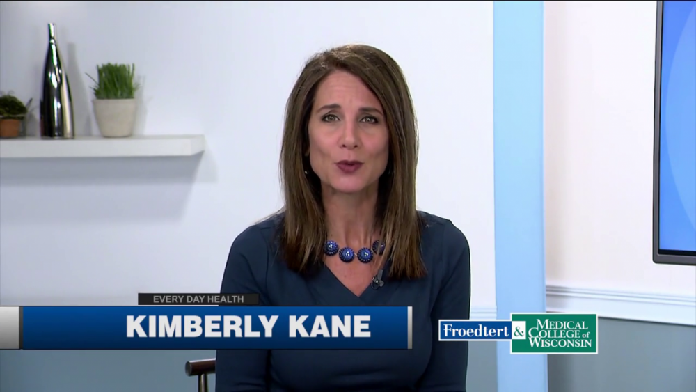
i can assure you... everyday health was 100% done in-house and pre-dates scripps ownership of the station... and long before tmj started working with the graphics hub (that did not happen until right before tmj debut the current gfx)... if my memory serves me correctly... that lower third was thrown together in an afternoon... any resemblance to a scripps graphic is purely coincidental... https://www.youtube.com/watch?v=Zo5iF85FGv8 not the same...1 point
-
Not to turn it into one of those threads but KNXV has uploaded a billboard with the new look. It seems like the only animation on the entire thing is the logo outline fading in in the background. It's just... weird.1 point
-
Honestly, I think the Hearst look is far better than most any other station group gfx. As for the new Scripps gfx, I can't even compare the Hearst gfx to those.1 point
-
1 point
-
I can't help but notice how similar the graphics look to what's been rolling out on the Meredith stations (especially the L3s). That's especially interesting since there are at least two markets where Meredith and Scripps both compete (Phoenix and KC).1 point
-
You have no idea what I've seen and heard. Thank you for your presumptive diatribe.1 point
-
The first WLKY “Wednesday’s Child” segment from 1980 - posted by Liz Everman herself:1 point
-
I doubt if KXXV will be the next station to receive the package. Quite frankly, this package needs some work before it can be rolled out to other Scripps stations around the country. Also @Weeters mentioned on Discord about the ex-Journal stations perhaps resisting on the new graphics package could Scripps tailor the new look for the ex-Journal stations? I think it'll be very interesting to see how Scripps does with this package.1 point
-
Watching TMJ's morning show, and I'm pretty sure this is the cut they used for their morning headlines summary segment previously.1 point
-
I do agree. I think this package does have great potential if executed better. Also, it's their first day and there are graphical elements they haven't even used yet based on the screencaps posted earlier in this thread. I do like the direction it's going though; much more modern than what they currently have. The current package grew stale to me after the first year. I also really wasn't a fan of Inergy. KGTV didn't really use too many different cuts so that got old quickly as well for me.1 point
-
1 point
-
1 point
-
Here's the open. A commenter to that vid suggested Scripps should've updated their existing graphics like Hearst did with their Diagrid. Great comment and I agree. Edit: I didn't notice someone already uploaded a montage before I shared the open1 point
-
And the earth-shattering major announcement is... Alan Sealls will be WPMI NBC 15's chief meteorologist starting in January. https://mynbc15.com/news/local/alan-sealls-the-gulf-coasts-chief-meteorologist-joins-nbc-15-as-chief-meteorologist Surprised his non-compete was only for six months after leaving WKRG.1 point
-
A lot of that has elements some of these stations would have used individually without group graphics... like the station logo ghosted in the background on the full screen shots. These are a huge upgrade. I think some of you guys are having trouble with how simple they are but mobile app style graphics are where the world is headed... the old package had no individuality at all. Somebody at Scripps realized that it can’t be completely one blanket design with no individual elements.1 point
-
It kinda looks like a gen 2 of the Limerick graphics if Raycom didn’t get bought out.1 point
-
1 point
-
That is horrible and I get to use the dislike button on here for the first time.1 point
-
1 point
-
this pkg is a big disappointment... it has all the makings of something done in-house... at least tegna went outside the hub to get a designer... doubt there will be a warm reception to these from many stations management teams... to go from flashy renderon graphics (which most of the old jbg stations have used since 2004) to... this... this might be the second coming of the burnt orange scripps pack... i give it a few years before it gets replaced... hopefully the rumors of the "alternate package" are true...0 points
-
I know I am among the minority, but I love it. I feel like it is TEGNA done correctly. It is clean, slick, and I really like the music. I think with a few tweaks per market for edgier cuts, I think that will make it pop for larger markets. The music actually reminds me of 360 from KLAS.0 points
-
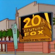
Now that the searchlights of 21st Century Fox are no longer part of the brand identify of the New Fox network, they’ve rolled out a rebrand earlier this Fall. I’m curious whether this abstract logo will find its way into local station identities and when the searchlights will start to disappear from local stations with the dated, so-called “kite” logo. more on the rebrand here: https://www.creativebloq.com/news/fox-entertainment-rebrand-1 points
-
This is so painfully generic. It reminds me of those terrible mock newscasts that you see on TV shows to indicate some content being briefly tied to the TV show episode. This is what you get for in-house garbage graphics hub. Also the music is literally the least interesting thing that I've ever heard from Stephen Arnold. How much did any of this cost? $250 and a lap dance?-1 points
-
With the current graphics package they have been VERY flexible and giving on individualized graphics, transitional elements and localized weather backgrounds. I doubt that would stop with a new package. It seems more like a company policy. I just think that station in Tallahassee isn’t very good and that really hurt the implementation and influenced, perhaps unfairly, our perceptions of the implementation of the new look. That’s the real problem here me thinks.-1 points
-
There is no alternate package. All stations will be very basic. Very blue. I like the idea of a clean look, but this is so far off the mark. Thin, small fonts that are difficult to read. Slow, limited movement. There just isn’t anything artistic about it to stand out and know this is a Scripps station. At least TEGNA has some texture and movement around their flat graphics. I just expected better from Scripps.-1 points
This leaderboard is set to Chicago/GMT-05:00


