
Leaderboard


Popular Content
Showing content with the highest reputation on 10/21/19 in Posts
-
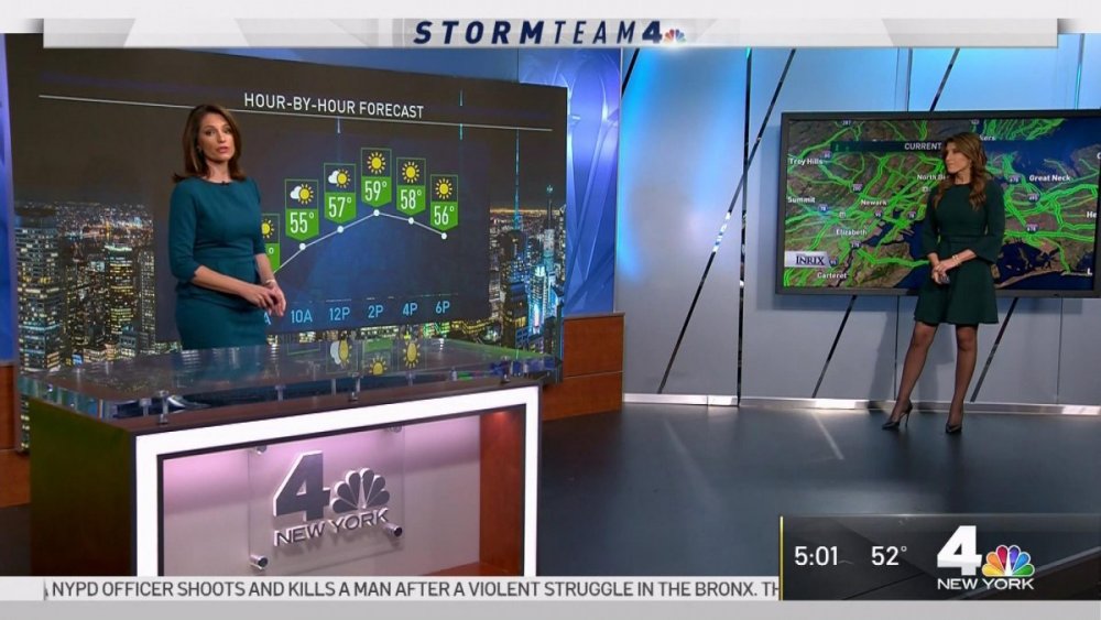
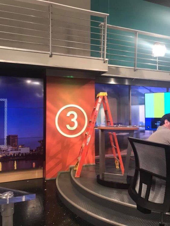
WNBC has done some updates to the studio. They added a silver frame around the large video screen. The higher floor for the area to the left of the news desk has been removed and they added sliver molding to the bottom of the walls. The desk next to the left of the video wall was not there today.
 2 points
 -
They should hire the whitest, stiffest, most boring white guy they can find. I bet you could get a lot of fish out of the water, unintentional comedy out of it.1 point
-
Live on Lakeside isn't doing much better either.1 point
-
Don't forget Hometeam 19/43, 43 The Block, numerous attempts from WKYC (5:30, Weekday Fever, multiple attempts at a one-hour 6pm newscast), Today's Morning Exchange, any of WEWS' in-house attempts to replace Ted Henry, Cleveland Television News (WOIO and WUAB's merged newsroom circa 1995), and so on. Am I missing anything? Speaking of ei8ht is News, here are commercials from when WJW was transitioning from that branding to FOX 8. Even the announcer was calling it "Fox ei8ht is News."1 point
-
Pencils have erasers. There have been plenty of failures in the Cleveland market that have morphed back into their original formats....ei8ht is news...Five o clock Fox, WEWS's Your Day Ahead, Martha in the Middle, the 19 News Glasses cam...the list goes on and on... Once the ratings tank, the upside down Peacocks will be plucked and the elevator will be taken out of service....1 point
-
I'm not convinced the FTVLIve story is accurate, simply because I can't imagine anyone high up in the company would have allowed WKYC's blanket rebrand to go through were that the case.1 point
-
Here's the latest from Cleveland.com on WKYC's new look: https://www.cleveland.com/arts/2019/09/wkyc-studios-attempts-to-bring-a-much-more-informative-breezy-vibe-to-all-of-their-news-formats.html1 point
-
The Morning Exchange comparison is the most interesting observation of the bunch - because that's a format that has and can worked well in Cleveland and attract some new eyeballs.1 point
-
I can see it now. A 2:07 am newscast called "3 News: Let's Go Get Some BBQ and Get Busy" or "3 News: A Hero Ain't Nothin' But a Sandwich." It would feature TV and movie clips fitting to news stories with popular tunes as news music. It would be dope! (By the way, I'm being sarcastic)1 point
-
If I were going to create a show, I would do something which incorporates elements of the old local variety/talk shows they used to have. I would make it more of a what's happening in town kind of show as opposed to a show that focuses on car accidents and people killing each other in the hood. I don't know if it would work or not, but local news is stale.1 point
-
I actually like the Channel 5 logo more than the new Channel 3 logo. Like you said some love it, others hate it. Then there are those who are indifferent, and just want the news. Even Channel 19's current logo (a HUGE improvement over the Cleveland 19 logo, which was the "Cleveland's CBS 19" logo but with a different color scheme that was more of the Wolverines and even the Warriors) is better than 3's new design. That's just my opinion.1 point
-
Scott Jones in 1959: "This is Westinghouse"1 point
-
Because it's thin and does not pop! Not comparing to Univision, that's a joke. WKYC's logo will be lost. It is terrible.1 point
-
Perhaps, but I see heavy “fluff” influence on all their newscasts - and in a top-20 market like Cleveland, we could use actual NEWS. A piece on White Claw and Polk giving away swag in an 11pm newscast is ridiculous. Or, maybe not if they want to appeal to the lowest common denominator.1 point
-
And then this guy shows up
 1 point
 -
The 6pm show is an abomination. The content alone belongs in the C block of the 4pm news. And then there's the graphics.... Spectorsky was at the helm during the station's best years. His wife may as well be a stooge for Tegna and their efforts to "fix" local television.1 point
-
It is the “mastermind” of a gent with no broadcast design experience who admitted he “didn’t watch broadcast news.” https://www.linkedin.com/in/john-forgetta-a2313b44 Their “Director of Content’s” claim to fame is the 4th hour of Today. https://www.cleveland.com/tv-blog/2018/08/today_show_producer_adam_miller_named_director_of_content_at_wkyc.html As for GM Micki Byrnes? How could she let this happen? Gotta wonder what her husband (former WKYC GM Brooke Spectorsky) thinks of this evolution...1 point
-
I saw that af the end of last night's 11pm show too. But for how long? They always find a way to cook these numbers.....1 point
-
Hey, if WKYC's new open doesn't work, maybe this could be Plan B: Imagine the anchor teams in this!1 point
-
An American attempt at being European. If you feel the need to air a package about how your new look will work, it's probably too complicated. Or you think your viewers are total idiots. As a nitpick: you can have a logo that emphasizes the "all encompass" of WKYC and seem a little more inspired than that.1 point
-
I'll give it a chance. But I'm a firm believer in if someone hypes something into oblivion, it better rock my socks off.1 point
-
Well looks like Tegna is doing a custom graphics package for WKYC. It's actually not bad, tbh. Clean and simple.1 point
-
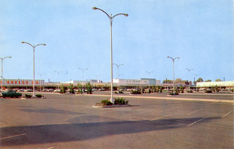
I just wanted to point out one more thing. Look at retail store fronts back in the old days. They all kind of used the same lettering on their storefronts. This WKYC logo isn't exactly old school, but it is more in that direction. For anybody who cares, the picture is of the Monroeville Miracle Mile Shopping Center in the Pittsburgh area. But the same developer had shopping centers in various Ohio cities and they all kind of looked the same..
 1 point
 -
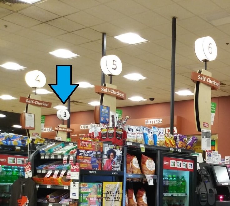
I love those pictures and how it looks. That said, I was at Giant Eagle tonight and maybe that's where they got the idea?
 1 point
 -
@JosiahCubed - I don’t hate simplicity in logos as much as I hate the fact that they threw out years of brand equity for something that basically looks like Arial Narrow in a circle. I’d encourage them to put some thought and rationale behind their design decision. This just feels like change for the sake of change. Regarding good examples of simplicity: I love WBNS’s most recent iteration of their “10”. It stripped away all those obnoxious effects (hello there “10TV News HD” ) yet kept the “10” logo they’ve had since the 90’s in tact. WKYC could’ve easily stripped away the effects of the previous “3” and delivered something that looked less generic yet still carried on the equity they have built. But it’s likely their goal to break it all and start fresh. So if that’s the goal, then they’re succeeding... FYI - I am also a marketer and graphic designer by trade.1 point
-
1 point
-
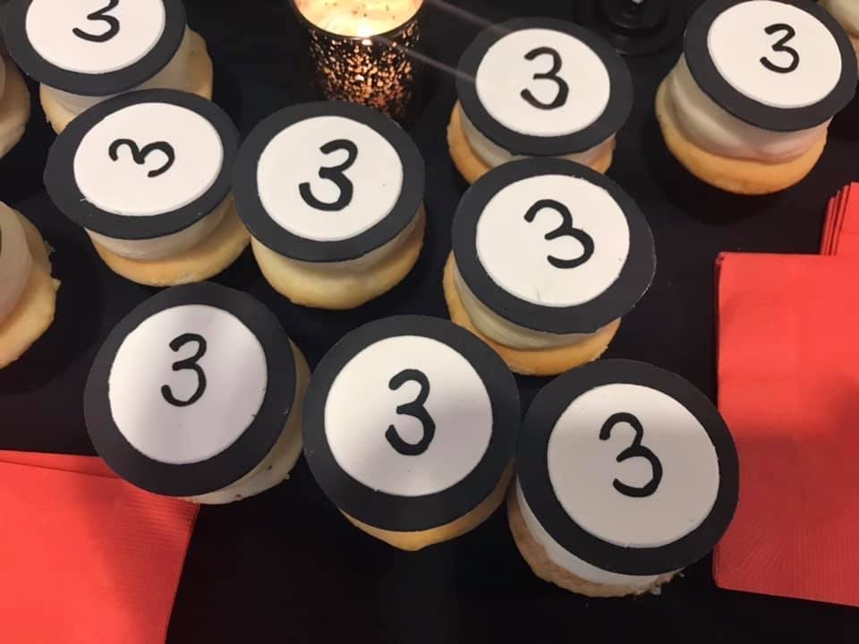
Some behind-the-scenes images... I bet it was difficult to put that logo on the cookies
 1 point
 -
I'd wish 'JHL would just take 'NCN's lead and honor the Network/Channel branding...1 point
-
And they couldn't ditch that gawd-awful "11" ?!?!1 point
-
We'll keep the concepts to a minimum, but I will say, I'm very impressed by WTHR's upcoming Tegnafication.
 1 point
 -
I wonder how much the person who took .32432432 seconds to design this "logo" (it ain't one sorry) got.... I wouldn't even give a quarter for it...1 point
-
FTVLive brings up another good point.... In the eyes of ratings, the "news" is going away and being replaced by these other-named shows. https://www.ftvlive.com/sqsp-test/2019/9/19/exclusive-cleveland-station-to-no-longer-have-newscasts All this is really doing is taking away any comparison to other newscasts....correct? Alas, instead of companies actually improving their products they just try and hide the problem by gaming the numbers....1 point
-
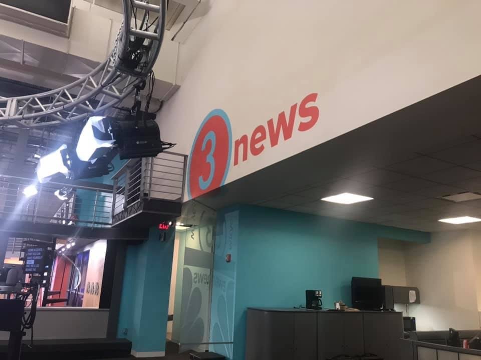
The definitive photo.
 1 point
 -
My ultimate problem with the change is not that they're getting rid of the old logo. My issue is that, if you're going to get rid of a logo with a quarter century of brand equity, then you better knock it out of the park. This is the perfect example of change for the sake of change. This might be hinting to a forum member in particular, but just because it's new, doesn't mean it's better. We've had our gripes over other Tegna rebrands (WFAA, WUSA, KHOU, etc.), but those maintained a sense of identity or a signal that they are for a TV station. This might as well be a billiard ball, a public transit route, a highway sign, or a new button on a video game controller. There's simplicity, that I can respect or appreciate, but then there's uninspired laziness.1 point
-
Nah, it's just a case of a company overreacting to current trends and putting their market position on the line to chase the almighty millennial...1 point
-
Complaints might get all the way into the double digits.1 point
-
This even seems like a classy promo these days. They should have done the reboot like WPXI did in 2006.1 point
-
More or less, this logo re-appeared in the early 90s when Multimedia assumed majority ownership of WKYC. Back then, even NBC's affiliates played into this style. How they ever went to the "Proud N" and Serif Gothic from this is mind-boggling. And then there was the awful programming during that era when even Fred Silverman couldn't save them.... I've started a new thread in the Graphics section about the impending "3"....i'm all for moving discussion over there as WKYC's relaunch nears closer....1 point
-
Good luck with that. That's like telling McDonalds to have some local flavor to it. If it's corporate it's corporate.1 point
-
KALB in Alexandria, LA, had a similar logo in the late 70s, although theirs was either drawn or designed rather poorly.....
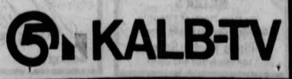 1 point
 -
Here's an old KYW (Cleveland) logo...looks kind of similar, doesn't it? According to Logopedia, this was the second logo after the Triangle 3 logo that Westinghouse introduced when they "moved" to Cleveland. It wouldn't be until 1963 that KYW got the "Westinghouse Treatment" complete with font and all. Two years later, the swap was nullified and NBC came back to Cleveland and Westinghouse went home to Philadelphia.
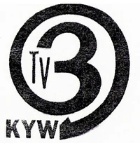 1 point
 -
Bah, I like that new WKYC logo. It's simple and to the point, tells you everything you need to know. Hey, when you see that 3, you know it's coming direct from Cleveland. You know what's boring? Those blue-and-white Circle 7s, those suckers are everywhere. You see one of those, it could coming from any of the nine zillion Channel 7s around the nation that were too lazy to come up with something unique. And since I had no clue what the current WKYC logo looked like, I went to their website. It looks like a ne'er-do-well 3 leaning against a wall while a shady peacock looks around the corner for unsuspecting rubes to mug. Hardly trustworthy, I'd say.1 point
-
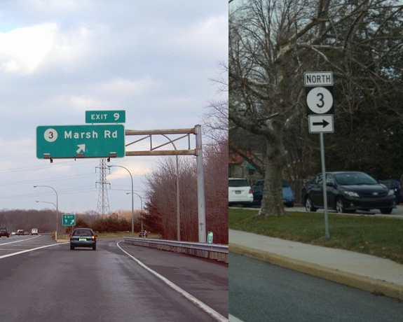
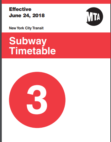
Or copied it from the New York MTA. I've seen some bad design decisions in my time - working in IT, its inevitable I suppose - but this...I can't even wrap my head around this one.
 1 point
 -
Someone saw the "3" in the universal film leader and decided 'hey, this is good enough'; It's just kind of blah...WISC did a much better rendition of the 'circle 3'...hopefully it has a little more life in actual use. I understand minimalism is the new thing, but this is absurd.1 point
-
You got to be bleeping me. Seriously. What the hell is this?!! Forget the lottery ball, this is worse. It looks like they took the "3" from a sign out of a street corner. This is not a TV logo, it's an outdoor sign. I swear you can't get any worse than this. Pitiful. Just plain and extremely pitiful.1 point
-
Oh. My. Gawd. Someone please tell me this is a placeholder logo, like what WTOL did a few months back. 3 Ball makes Lottery Ball 5 tolerable in comparison....1 point
-
CBS 19 News with Denise Dufala and Gretchen Carlson. Lasted about a year perhaps? This was after Emmett Miller left and before they hired Kevin Cokely. Jack Marschall would later add WOIO's newscasts to his WUAB duties until the great Action News blowup of 2002. Was this after Bob Hetherington left? IIRC it was Charlene Brown and Yolanda Harris?1 point
-
So is WKYC getting a circle 3 logo or is this sarcasm? Dead serious here. I don't know what to think anymore from whatever comes out from Tegna these days....1 point
-
Nexstar needs THIS for its stations!1 point
-
I want to like this - as it is definitely “on trend” in terms of a flat design. But - the open is sloppy and clearly inspired by TEGNA. (Diagonal stripe pattern is an obvious similarity.). I do like the transitions and wipe/masking effects. The set is a nice variation of what we’ve seen in recent Nexstar sets - similar to WISH but with an overall “darker” palette and varying textures. Plus, unique features like the bridge cables and street patterns really bring a “local” flavor. In this age of consolidation, I appreciate Nexstar’s approach to individual station branding and identity. (Which is obviously a remnant from Media General and Lin.) I wish TEGNA, Scripps and Sinclair would take a similar approach, It’s standardization without being too cookie cutter - offering options for individuality amid a slate of consistent design elements.1 point


This leaderboard is set to Chicago/GMT-05:00