
Leaderboard


Popular Content
Showing content with the highest reputation on 10/21/19 in all areas
-
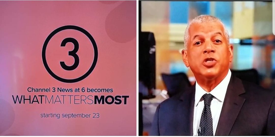
WNBC has done some updates to the studio. They added a silver frame around the large video screen. The higher floor for the area to the left of the news desk has been removed and they added sliver molding to the bottom of the walls. The desk next to the left of the video wall was not there today.
 2 points
 -
What is it with crimes against local broadcast journalists? This is sick.1 point
-
If Chad were smart, he would make Michelle permanent weekday AMs - leave Shirleen at Noon. She should have had the position from the get-go, as there is real chemistry between Michelle and Ken, and the morning show numbers have been up since she went on leave. Shirleen is a great newsreader - but her interactions with others just seem forced.1 point
-
Michelle is subbing for Shirleen until later this month. Rob posted on social media that is taking time off as his partner is giving birth. I hear they’re all back sometime next month.1 point
-
Live on Lakeside isn't doing much better either.1 point
-
I'll just say this: remember that the changes at WKYC are more WKYC's doing than Tegna. Just like how Raycom/Gray allowed WOIO to have autonomy from the other Graycom stations. Worst case scenario, WKYC can go back to Troika/C Clarity when the refresh package comes out.1 point
-
At least WJZY was an upstart with nowhere to go but up.....but it started when they began doing a real newscast and not their half baked effort.... WKYC? They're like "let's take a station that rose from the doldrums of "farm teaming" talent into a well executed, polished, informative news operation....and trash it all for some young cheap talent who knows cool buzz words and social media...and some new pretty graphics!"1 point
-
This whole WKYC thing is a better-executed version of what Fox tried (and failed) to do in Charlotte....1 point
-
It seems like a weird cross of the Tonight Show and View. If Jay is the only host, what is Hollie doing there? She's in the entire show. I give them props for creating something unique with the open and show title. "Lunch Break" isn't a bad name for a midday show at all. The glare on the monitor array needs to be fixed ASAP. Although it's only the first show and changes will have to be made, it still seems doomed to fail.1 point
-
It's amateur hour at "Circle thin 3".1 point
-
I agree with this, however, at the moment, WKYC airs significantly less news each day. They have less time to fill, and a deep bench of talent...and this is what we get? Their limited schedule should make them hyper-focused on broadcasting actual news.1 point
-
If only this site had some sort of analog back then. "Looks like Westinghouse-itis is rolling out across more stations with their WHYwitness format. 90 minutes? Please. I liked it better when the news was one person sitting at a desk for 15 minutes. We were lucky to have any pictures at all!" "Group W out with another lame logo... So much for individuality! Could they only afford one sheet of Letraset?1 point
-
I think this looks absolutely fantastic. The logo, the graphics, everything looks really really fresh. While I can't speak to the content this is the sort of thing I really want to see more of in broadcast graphic design.1 point
-
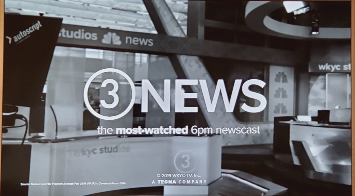
What works in WKYC's favor is that they've remained a strong station. This isn't a dog station like WTSP, WUSA or KNTV... WKYC has become a valiant competitor to WJW since the late 1990s and that hasn't waned. I'm from Cleveland. I've seen too many stations get boring McGraphics and get the same basic look. The 2007 Fox O&O package, the 2008 Gannett package, the 2009 Scripps package and the 2014 Raycom package were among the more boring visual looks possible... harmless, but boring. This is... audacious. It's easily the best look for a local TV station I've seen since the JcB WOIO nineteen era of the late 1980s. And seeing how the logo is presented, it's both static but fluid... it's a literal contradiction. The NBC peacock is ... well... proudly a part of this, WKYC is showing their history and NBC ties and doing rather creative ways to emphasize it. Furthermore, leveraging the WKYC calls in tandem with "3 News" is equally commendable. The calls have value and cachet in the market. WKYC is doing their own thing with Tegna's full blessing, pouring money and resources into the operation. Funny thing is, when you invest in a station and hire people with bona fide credentials, that causes people to tune in! WKYC was the beneficiary of that under Multimedia and Gannett, and it continues today. And I can't let it be unsaid that Channel 3, then as KYW-TV, tried a rather revolutionary approach to TV news in 1959, 60 years ago. A little thing called "Eyewitness", a 90 minute newsblock that was so earth-shattering, WEWS' Dorothy Fuldheim was compelled to launch a competing newscast in response.1 point
-
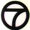
A longer review to come...perhaps. But look - even this would’ve been better. (Actual screencap from “Front Row” 3 on 3 at 7...)
 1 point
 -
1 point
-
Come on 8..... Come on 8......
 1 point
 -
I like this comment
 1 point
 -
Elevator3 and Lotteryball5 together.
 1 point
 -
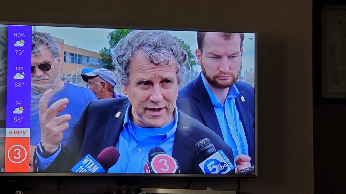
More like the folks at E. 30th and at Reserve Square are smiling. WKYC seems to be trying a more female-focused newscast (as evidenced by a lot of the news promos and also the colors. IIRC, the last station in Cleveland to try to be more female-focused was WOIO's "Snoozefest 19" and boy that worked well.1 point
-
Well, so far, the open is a hot mess. And Lynna Lai's story about the old look being "so 2018...." Sound effects aren't going to change my mind. The old look LOOKS better and does a much better job trying to explain the story.1 point
-
You can expect complaints from viewers about the new format, and low ratings for 'KYC... Because the new format won't last.1 point
-
I'll give it a chance, reminds one of the "Square 3" when it was own by NBC ,saw one of the TV Guide ads on a facebook group1 point
-
My thoughts. The line up reminds me of cable programming. That's what more people want! Cable news!! Also, about the logo, anybody down for a game of pool? I call stripes!1 point
-
It actually wouldn't be shocking if they did because the Browns are playing on SNF this week. But the website says Monday at 4am, so we shall see...1 point
-
It'll be later than 11pm because of SNF (hope the game goes to overtime so folks can sleep and not have to watch this trainwreck).1 point
-
This was when the background was the 3 itself. Here are the backdrops themselves. Like I said before some of us can't stomach that Circle 3.
 1 point
 -
Could be worse ...
 1 point
 -
Y'all want to know why the TV industry is in the shape it's in look no further than this. I can't explain how many people are in positions that they shouldn't be in and I've worked in 4 newsrooms in the span of 6 years. Sorry, didn't mean to go off topic here. To contribute: my thoughts on this logo is that it is indeed terrible.1 point
-
This explains a lot - the station’s creative director had no previous TV experience and admitted in this interview that he did not watch local TV. https://www.wkyc.com/mobile/article/entertainment/television/liveonlakeside/liveonlakeside/95-243d301f-06ca-4369-b280-50eafcfd45ca1 point
-
I'll give 'KYC props - It takes guts to put up such a dull, bare-bones, unimpressive logo across the building as if it'll last long1 point
-
You know what it reminds me of? And that was the channel's best era. As much as I want WKYC to open up that huge newsroom and do a similar style show, it's Tegna, so... ¯\_(ツ)_/¯1 point
-
Ew.1 point
-
FTVLive brings up another good point.... In the eyes of ratings, the "news" is going away and being replaced by these other-named shows. https://www.ftvlive.com/sqsp-test/2019/9/19/exclusive-cleveland-station-to-no-longer-have-newscasts All this is really doing is taking away any comparison to other newscasts....correct? Alas, instead of companies actually improving their products they just try and hide the problem by gaming the numbers....1 point
-
This isn’t like WPVI removing MCTYW.1 point
-
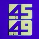
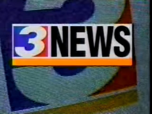
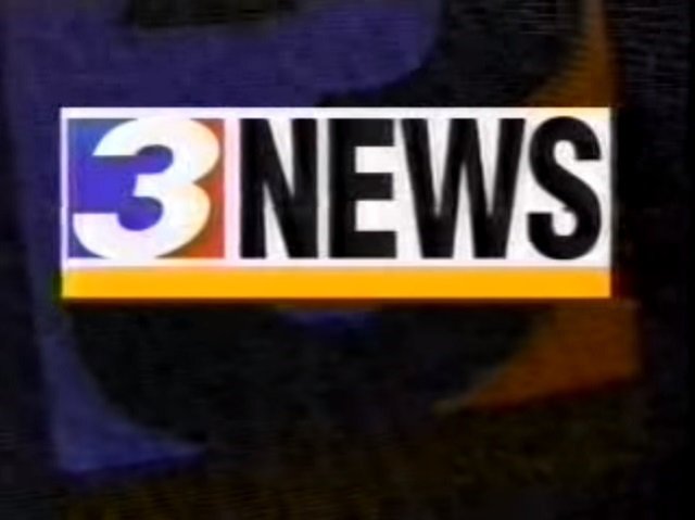
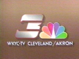
You can't even stomach this. But 1993 was the prime year for WKYC. I remember these logos.
1 point
-
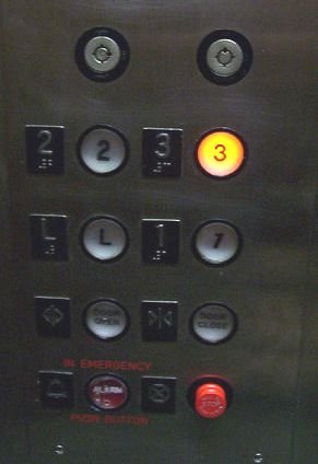
I keep pushing the new 3 logo in this darn elevator to get WKYC on the screen and nothing happens! Lol!
 1 point
 -
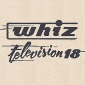
Even this piece of 80's design would be an improvement....
 1 point
 -
We really need to speak up to Tegna management and tell 'em we don't like changes on their local stations and demand that things on our stations need to be brought back and left alone. example: Leave the current WKYC logo alone, don't change it. Next, Reinstate "The Spirit of Texas" slogan back to WFAA, KHOU, and spread the Spirit slogan to Tegna Texas stations, and finally... get some better news sets from FX Group and/or BDI. Not some Tegna-Set-In-A-Box, and reinstate news themes (ex: KUSA News Package, Propulsion, The Tower, etc.) drop the C Clarity and gets some better news graphics.1 point
-
Just wait 'til this logo debuts and viewer complaints start flooding into the station on social media!1 point
-
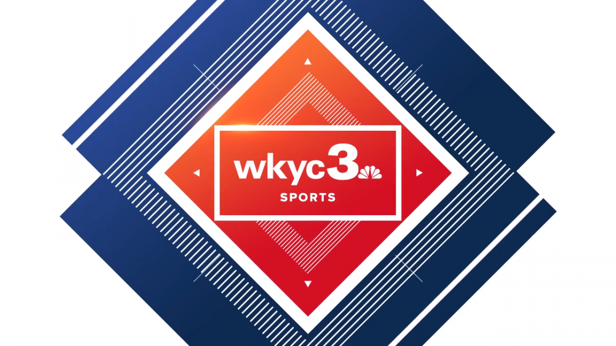
Their soon-to-be-new logo? ARE YOU KIDDING ME RIGHT NOW??? WHAT THE F$&% IS THIS?!?!?!?!?!!?!?!?!?!? THIS is where we're at with broadcast logo design? There are things in life that just doesn't need to happen. This is one of them. Now I gotta update their Logopedia page with this painfully underwhelming abomination that ANYONE can recreate in Powerpoint in just under ten seconds... It hasn't debuted yet and it's already giving every bad station logo a run for their money; yes, even this logo from station KXDF-CD. TROIKA EVEN MADE YOU A LOGO! AND IT'S 999,999,999X BETTER THAN WHAT'S ABOUT TO HAPPEN!!! (image below) 1. This logo is so underwhelming and bland that I cannot just sit on the sidelines and let WKYC or Tegna get away with this. 2. What works in Great Britain doesn't always translate well in here in the US.
 1 point
 -
3 ball...corner pocket.
 1 point
 -
Well, the last logo had a good run and evolved pretty well over the last 25 or so years. I remember the "We're building our station around you" campaign which literally featured shots of the logo being designed and physically crafted... Now all I can think of are elevator buttons, pool balls, road signs, and however else this logo sucks. I don't even think an NBC peacock could save it. So much talent in that building over the years with all of the innovation and breaking the mold and putting out a quality product. Then came the broken fax machine, and their best efforts to work around it. Ever since C Clarity hit the air, it was only a matter of time before the product was trashed.... I can only hope that Russ Mitchell ends up hosting the CBS Evening News (like he should have years ago) when their latest effort flops, yet again....and WKYC will hit the basement again like they were pre 1994......1 point
-
Agreed. I like that they're trying something new with their news programs that don't look or sound monotonous (not a dig at stations that do have uniformed news program names as many are iconic) and I wish them luck. And the names aren't that bad (or rather bad at all) to me either. On the other hand... That is bad. It reminds me of the first logo of The U.K.'s Channel 5. But their logo works because it's a station where news isn't it's main focus. This station's logo does not work, because news is.1 point
-
I can't even. And we thought the 11Alive logo or WFAArrow logo was bad. THIS CANNOT BE. (Maybe this conversation should move to a Graphics or TEGNA Corporate Thread?)1 point
-
Oh. My. Gawd. Someone please tell me this is a placeholder logo, like what WTOL did a few months back. 3 Ball makes Lottery Ball 5 tolerable in comparison....1 point
-
1 point
-
And since design trends are cyclical, I imagine we will soon start to see things like [ FIRST IN HIGH DYNAMIC RANGE ] [ PRESENTED IN UP-CONVERTED DIGITAL 4K ]1 point
-
Move over, | | | | | | | | | s, > > > > > > > > > is the new trendy thing in town.1 point
-
Nexstar needs THIS for its stations!1 point


This leaderboard is set to Chicago/GMT-05:00