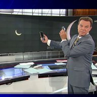
alex979 118 Posted October 13, 2014 Share Posted October 13, 2014 CNBC unveiled a completely refreshed graphics package today. Lower thirds and full screens were completely redesigned, and the lower ticker got an update. I was able to attach a screenshot, I'll try to post some more. Link to comment Share on other sites More sharing options...
Big Country News 435 Posted October 13, 2014 Share Posted October 13, 2014 CNBC unveiled a completely refreshed graphics package today. Lower thirds and full screens were completely redesigned, and the lower ticker got an update. I was able to attach a screenshot, I'll try to post some more. It's about time. FOX Business has gone through two graphics updates since it's launch in 07' and CNBC has stayed the same since. Link to comment Share on other sites More sharing options...
alex979 118 Posted October 13, 2014 Author Share Posted October 13, 2014 It also sounds like they're playing new show music before going to commercial. Link to comment Share on other sites More sharing options...
WCAUTVNBC10 408 Posted October 13, 2014 Share Posted October 13, 2014 Yay Gotham. So glad they got rid of Klavika. That has to be one of the worst fonts for broadcast. Transversely Gotham is one of the best. Good for NBC to recognize that. They seem to be moving towards that with a lot of their properties. Link to comment Share on other sites More sharing options...
MidwestTV 1173 Posted October 13, 2014 Share Posted October 13, 2014 It's about damn time! CNBC's graphics made me feel claustrophobic. Fox Business's didn't. I don't know what the rest look like, but I'm willing to assume that they're still overdoing the blue. They need some more variety in them...again...something that Fox Business does well. Link to comment Share on other sites More sharing options...
24994J 5269 Posted October 13, 2014 Share Posted October 13, 2014 Yes, it gives less information at any given time, but I now like CNBC's graphics better than the now-seemingly cluttered FBN look. Link to comment Share on other sites More sharing options...
alex979 118 Posted October 13, 2014 Author Share Posted October 13, 2014 Newscast Studio has a nice article on the new graphics. http://www.newscaststudio.com/2014/10/13/cnbc-debuts-new-graphics-package Link to comment Share on other sites More sharing options...
cbs2newengland 71 Posted October 14, 2014 Share Posted October 14, 2014 It's about time. FOX Business has gone through two graphics updates since it's launch in 07' and CNBC has stayed the same since. Nope not quite, in fact both had the same updates; in 2007, CNBC had an Artworks package and in 2010 revamped to that flat look up till Friday. Link to comment Share on other sites More sharing options...
cbs2newengland 71 Posted October 14, 2014 Share Posted October 14, 2014 Yes, it gives less information at any given time, but I now like CNBC's graphics better than the now-seemingly cluttered FBN look. are you a market junkie? Do you follow it often? I guess CNBC has been targeting the TriBecCa or the Brooklyn crowds who really don't care about markets, but kinda have a teensy interest on the business news. All they are doing is making their loyal audience be turned off of their lack of up to the minute market and biz news. Please don't give me the crap of the internets canablizing I hate how the index bugs are so small - its like they want to get rid of the thing that made CNBC what it was. In fact I hate the master controlled Fox Business graphics. Because the ticker is cluttered with the vertical bar, a headline bar that should crawl when it hits certain amount of characters and I don't pay attention to the sector bar; because its ridden with animation. Ether they consolidate it like the original package or get rid of it in place of the indices, because its hard to read it, on 9" set that many offices still use. All networks: Know your damn audience! Link to comment Share on other sites More sharing options...
Hazim 13 Posted October 14, 2014 Share Posted October 14, 2014 The same topic is also discussed in another forum. http://www.tvforum.co.uk/thenewsroom/cnbc-new-look-40416/#post-935991 Link to comment Share on other sites More sharing options...
cbs2newengland 71 Posted October 14, 2014 Share Posted October 14, 2014 The SD CNBC's ticker hasn't really changed and it appears they are FINALLY in HD. The new graphics are readable (that's if you are viewing it on the SD channel) Problems: You get a letterbox effect on the top of the screen both on programming and on commercial breaks. Right now, the markets aren't open - the stack bug is gone at the breaks. If you had a day like Friday - yeah sure you could go on your phone, but c'mon! The bug isn't showing full net point and value like the previous package. I feel like its the 90s all over again, where's the 45° tab? It is cluttered with animation, it pops up and a little colored line appears on the far left to indicate if its up or down. The ticker has been tweaked, ripping off FBN's vertical bar to break up the stocks. Not sure if CNBC still has full screen charts, but I'm glad they are using "Extended Hours" again since "Pre mkt" used to mean something totally different than electronic or extended trading. Link to comment Share on other sites More sharing options...
Geoffrey 779 Posted October 18, 2014 Share Posted October 18, 2014 Even though CNBC's graphics are "shiny," they do very much remind me of CNN's new "flat" graphics in that they're very rectangular. The tickers don't go to the edges and there's space between the tickers, the bugs and the lower-thirds. I think it's a nice look but I have some complaints. 1. Way too much animation: It's distracting. Especially on the index bug (or whatever it's called -- the one that shows the Dow and the others). So it flips when going to the next index. Cool. But then all of the text slides right over slightly more to make room for a thing color (red or green) bar on the left. Everything just seems to be "bouncing" a lot. And then there's more red/green color flashes that seem to be there just for effect (at first I hoped it was when a number updated but it doesn't seem like that's the case). 2. Wasted space: Do we really need the words "change" and "% change" on that bug? I think viewers are pretty sure what +263.17 and +1.63% mean. The bug could be made much smaller without that. 3. Lower-third placement: Why do some banners start out in a higher position before "flipping" to what I see as its correct position? It looks sloppy to me that they can't get everything to line up properly. Link to comment Share on other sites More sharing options...
cbs2newengland 71 Posted October 21, 2014 Share Posted October 21, 2014 Even though CNBC's graphics are "shiny," they do very much remind me of CNN's new "flat" graphics in that they're very rectangular. The tickers don't go to the edges and there's space between the tickers, the bugs and the lower-thirds. I think it's a nice look but I have some complaints. 1. Way too much animation: It's distracting. Especially on the index bug (or whatever it's called -- the one that shows the Dow and the others). So it flips when going to the next index. Cool. But then all of the text slides right over slightly more to make room for a thing color (red or green) bar on the left. Everything just seems to be "bouncing" a lot. And then there's more red/green color flashes that seem to be there just for effect (at first I hoped it was when a number updated but it doesn't seem like that's the case). 2. Wasted space: Do we really need the words "change" and "% change" on that bug? I think viewers are pretty sure what +263.17 and +1.63% mean. The bug could be made much smaller without that. 3. Lower-third placement: Why do some banners start out in a higher position before "flipping" to what I see as its correct position? It looks sloppy to me that they can't get everything to line up properly. 1. What's worse when an up/downtick occurs, the bar animates. 2. Get rid of the words and make the text bigger, and stick to INDU/IXIC/SPX and 10YR/ Crude and Vix. And Euro markets prior to the open. If you want go back to the 90s, then go fully back to the days when the bugs focused on the most important markets. 3. I think its actually a design thing, and not an error. Also if I am not mistaken, the ticker last week didn't feature the ticker symbols, and if that was the case, it was brought back yesterday. They still haven't eliminated the vertical bars (that can be also visible on the upper band.) If I haven't said this already, I don't like the graphics fusing in the video, like in a breaking news stinger, the video shot zooms out into the graphics moves to the stinger and zooms into the video. It's a little freaky and unnecessary, viewers can divert their own attention, the graphics doesn't need to do that. CNBC: You need to get a new theme package already, this Doom and Gloom is not pleasant to the viewer; its the official theme song for Bear Markets. Link to comment Share on other sites More sharing options...

Recommended Posts
Archived
This topic is now archived and is closed to further replies.